Cateredfit
Meal Delivery Service
Cateredfit is a 5 year-old business located in Florida that delivers ready to eat, fresh meals to their costumers every day. Our goal was to design an experience that allowed for users to try and order online.
MAIN TARGET
People in their 30’s looking to be healthier and into fitness.
PRODUCT
Website for a meal delivery service.
USER JOURNEY
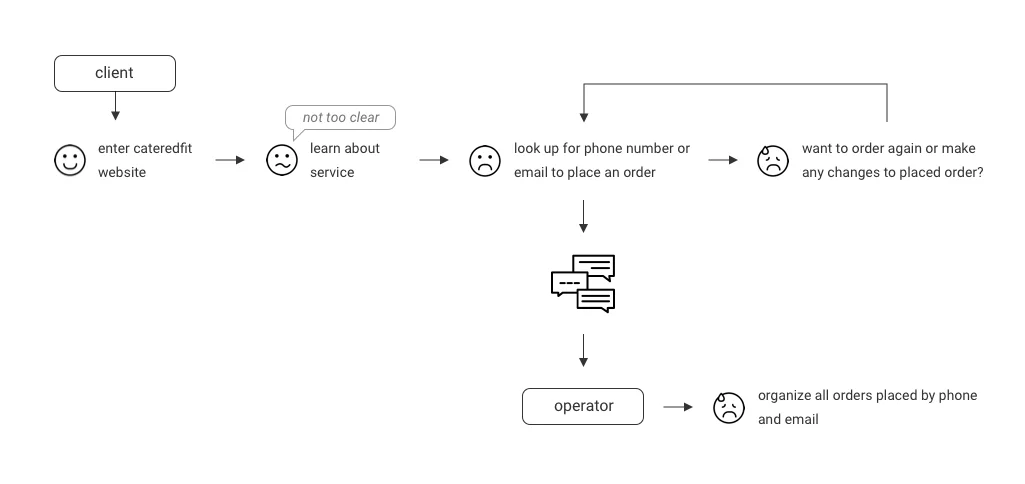
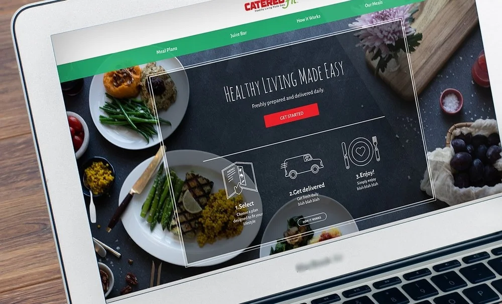
Image below is from previous website

CONVERSATIONS WITH USERS
Asked friends that are into fitness or want a healthier lifestyle what would motivate them to try a meal delivery service.

Quality and freshness of meals

Variety and options in menu

Efficiency in plan

Jay Thomson
Age: 30
Location: Fort Lauderdale, FL
Occupation: Marketing Specialist
BIO
Jay wakes up early ready for a big organic breakfast and crossfit. Her job keeps her pretty busy but in her free time she enjoys sharing nutrition and fitness advice through her blog. She like to cook but she does not have time to do so every time so she usually takes shakes and green juices on the go. Jay enjoys the outdoors and traveling is her passion.
FRUSTRATIONS
-Spending time looking for new healthy places to get quality food.
-Finding time to cook with quality ingredients.
GOALS
-Grow her blog's popularity and help people achieve fitness goals.
-Keep growing in her career.
-Find new healthy foods that fit her lifestyle
"I wish I could spend less time looking for meals that fit my lifestyle and not eat the same thing at the same places during the week"
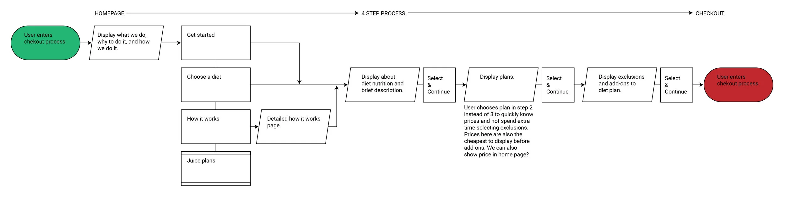
MAIN USER FLOW
User needs to understand and checkout in one flow.
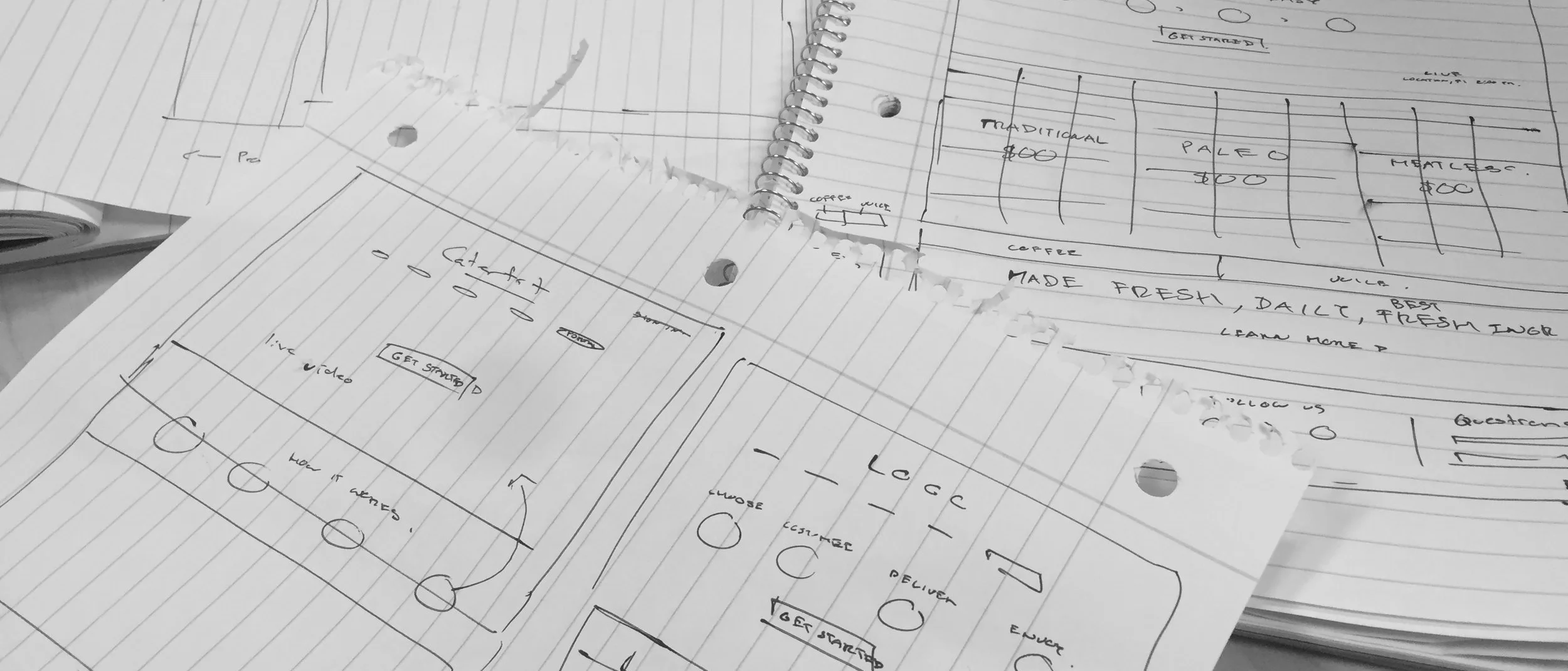
INITIAL WIREFRAME INTERACTIONS
Presented a quick flow where the user begins by selecting a meal and plan in the website followed by asking them to create an account and finish the order inside their account.
After internal testing, we decided creating an account was a pain and decided to let the user try the product and order without creating an account. Creating an account became a secondary flow for users to manage future orders.

Image above shows what other services where doing in their experience.
Why do I have to enter my zip code and email at the begging or in the middle of everything?
Asking for user information right away showed to be a pain that took people out of the seamless process. We decided to let the user experience the service and just ask for a zip-code and email before checking out to make sure we can deliver there.
VISUAL DESIGN DIRECTIONS
If this looks healthy, tasty and simple, I think we are on the right direction. ( Sorry if this makes you hungry )
MAIN FLOW WITH RESPONSIVE
Animations always work better than words!
USER TEST
While the flow was working good, some visuals were confusing to the user and so changes were needed involving the placement and color of some elements.
FINAL VISUAL DESIGN
The client and marketing wanted "less white and clean" to having more textures and also provided me with photos on a dark background which challenged me to change the visual direction.
There is more to see!

Pizza delivery
Can we deliver not just pizza but also a better experience through an app?

Fleet management
How to help small businesses in LATAM manage and have control of their fleet?