Jefferies
Financial and Investment services
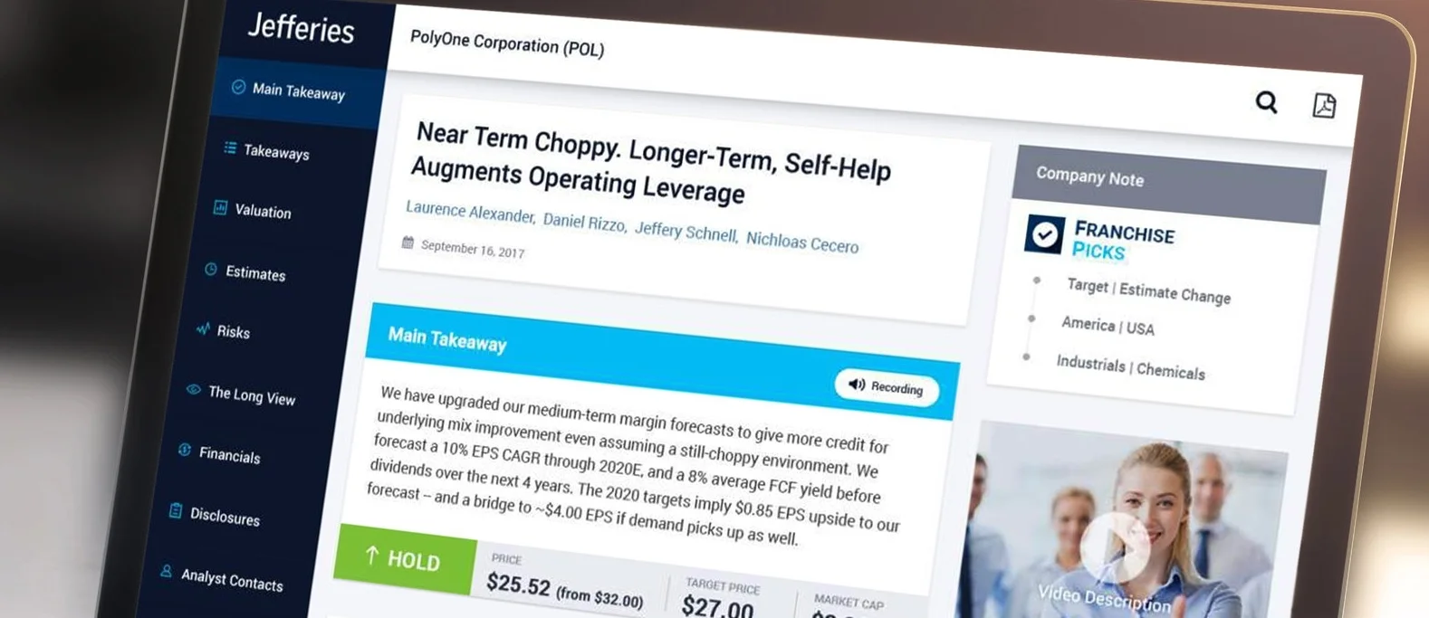
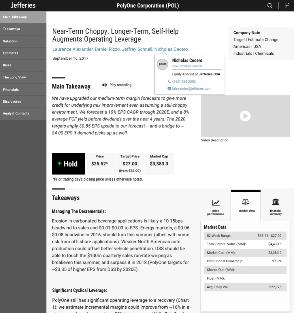
Translate multiple report PDF templates (10 total) composed of research content into an html responsive format to easily distribute among clients and company employees.
TARGET
Jefferies employees and clients. Most of them 35+ years old.
PRODUCT
Financial platform.
ROLE
Lead by Jennifer Bender (Art Director)
Dhanesh Thadathil (Visual Designer)
Jose Luis Santiago (UX Designer)

How can we make financial research reports be more clear?
RESEARCH
We talked to multiple research analysts and one salesperson to better understand how these reports are handled and shared among them and with their clients.
"Users do not often go beyond the first page of information and I believe a quick summary, market rating, some market data, and valuation information are the most valuable."
"We should make information very easy to find and navigate through. Some content might not be used but must be present because of legal reasons".
USER JOURNEY
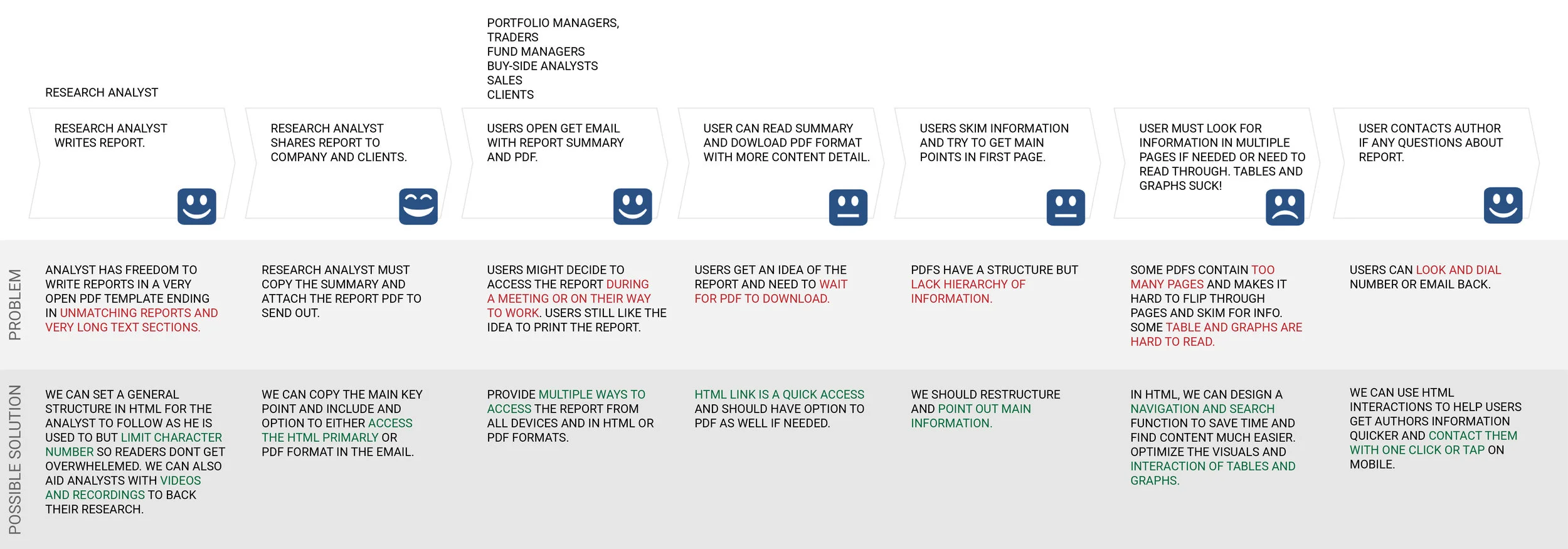
LISTEN AND TAKE NOTES
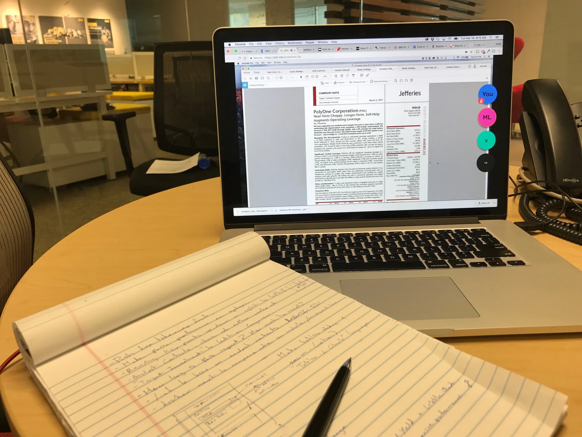
It was extremely important to keep constant communication and feedback from industry leaders as they knew better what information they needed and when. Weekly follow-ups were done to ensure we were working on a better user experience for the people that use these forms every day.
PERSONAS
We developed personas based on our user interviews.

James Thomas
Age: 36
Location: New York
Role: Research Analyst
BIO
James is an analyst for Jefferies. He is in charge of keeping track with the market and creating the research reports to distribute every morning. James has to be ahead of the game and ready to inform his clients.
FRUSTRATIONS
-Hard to format tables and charts and make them easy to read.
GOALS
-Produce quality reports that engage the users.
“Get the user to understand the main points quickly so they do not lose interest.”

Antony Gallow
Age: 52
Location: New York
Role: Fund Salesman
BIO
Antony is always in contact with clients and keeping strong relationships with them. He is always driven to stay inform about the market in order to follow up with clients and land more possible accounts.
FRUSTRATIONS
-Concerned about the amount of emails clients get.
-Reports are not always uniform or structured properly.
GOALS
-Keep a financial summary on the frist page and highlight main content right away.
-Access to mobile reports so clients and him can see them anytime when away from their desktop.
“Clients always look for a financial summary and quick points to help them decide on their investment decisions.”
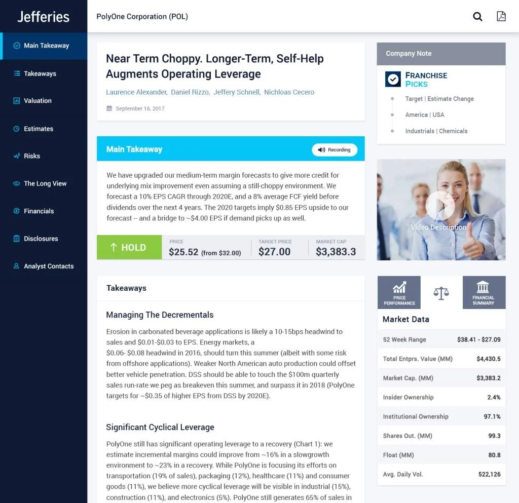
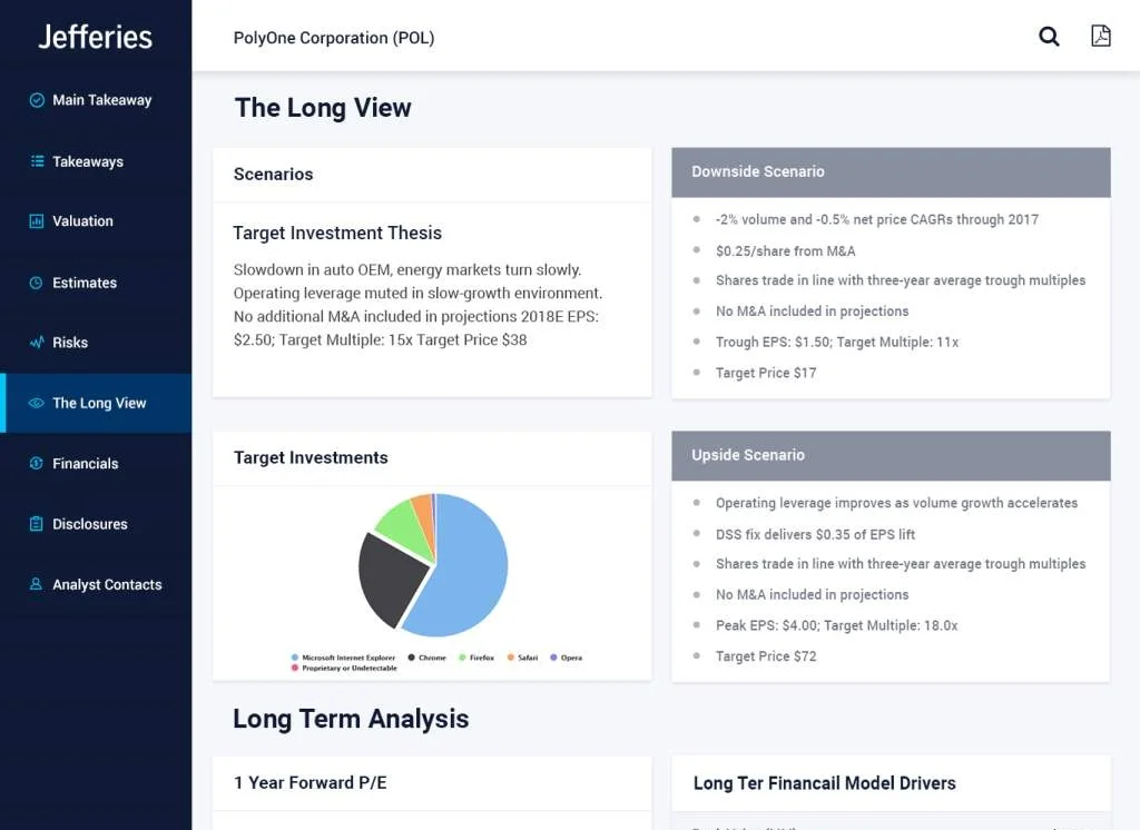
WIREFRAMES
Lets mark what users seem to be more interested in the forms to translate it into a responsive layout.


WE CAN DO MORE ON HTML THAN ON PAPER
Left navigation as a very familiar and easy to navigate approach with content arranged in order among all notes with the flexibility to add or remove sections if needed and not compromise the design.
Scrolling feature where it is all connected and navigation jumps as you scroll to the next section.
New interactions and features such as videos, recordings and author contact cards that can be used in an html format.
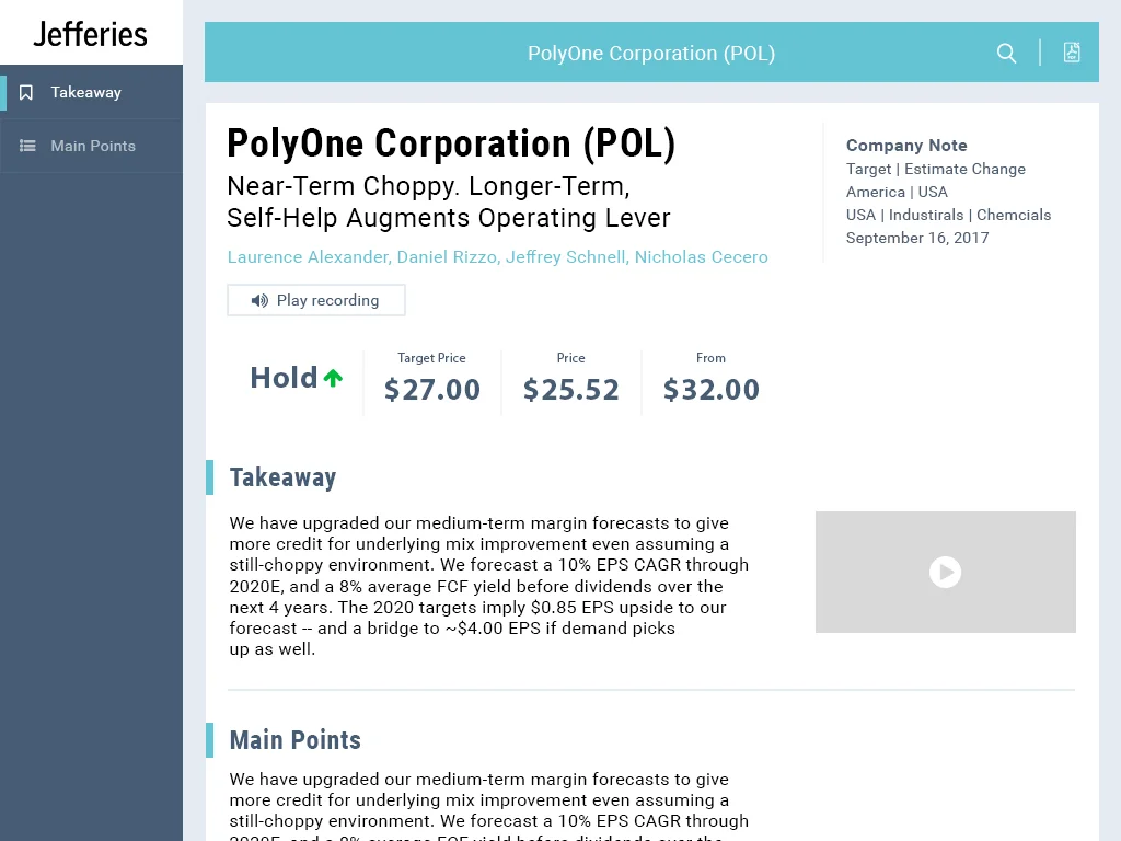
EMAIL TEMPLATES
Share only the main points and a way for the user to easily dig deeper or get back to us.


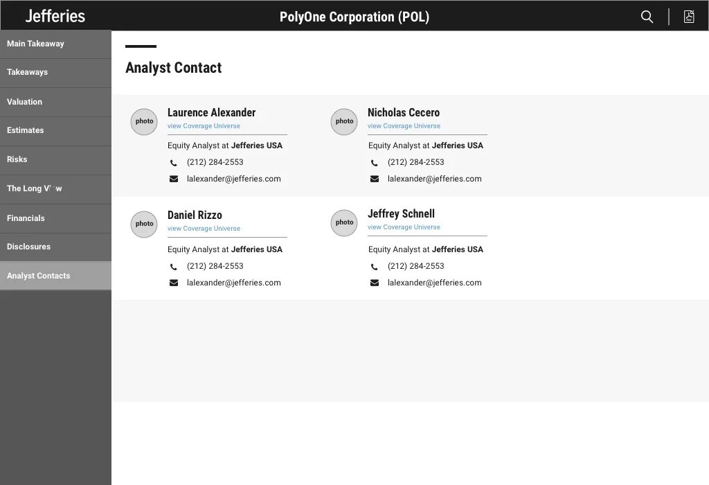
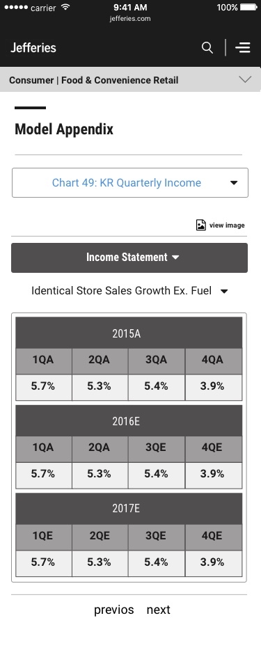
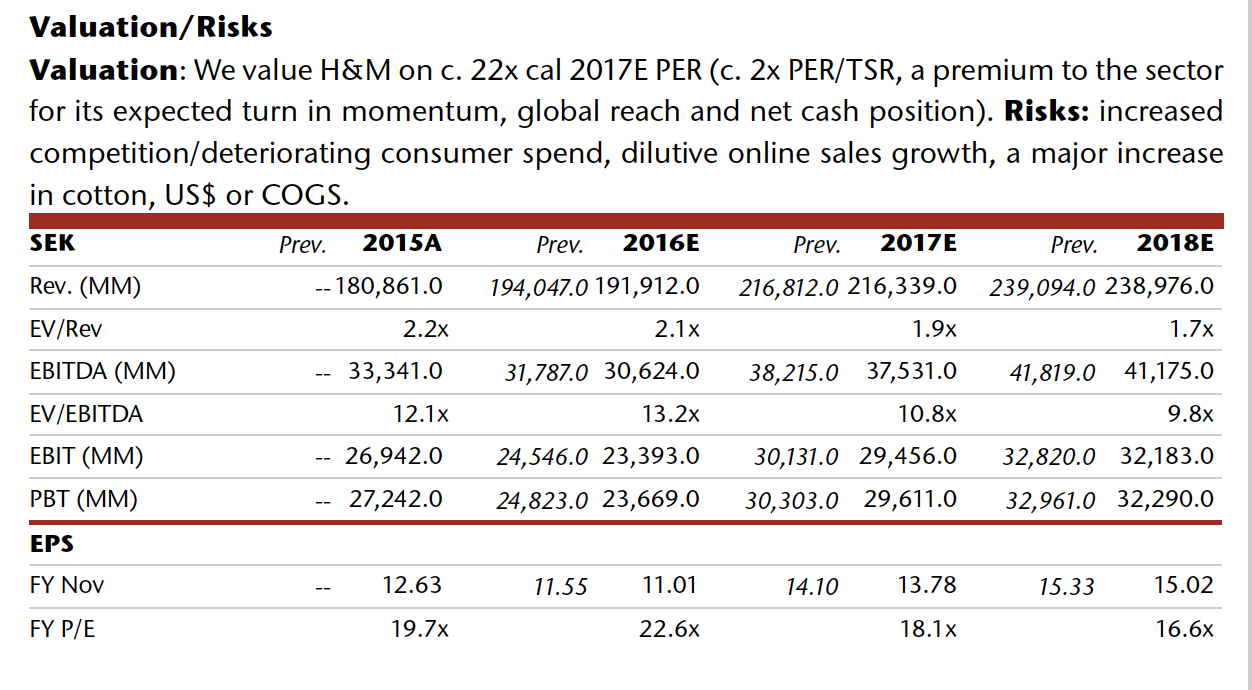
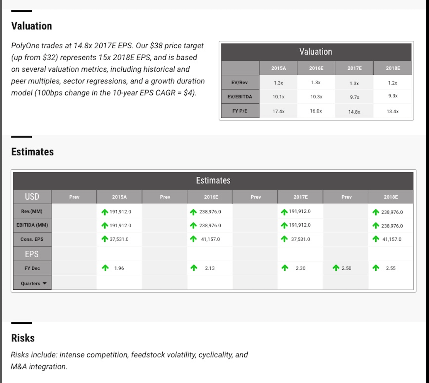
RESPONSIVE TABLES
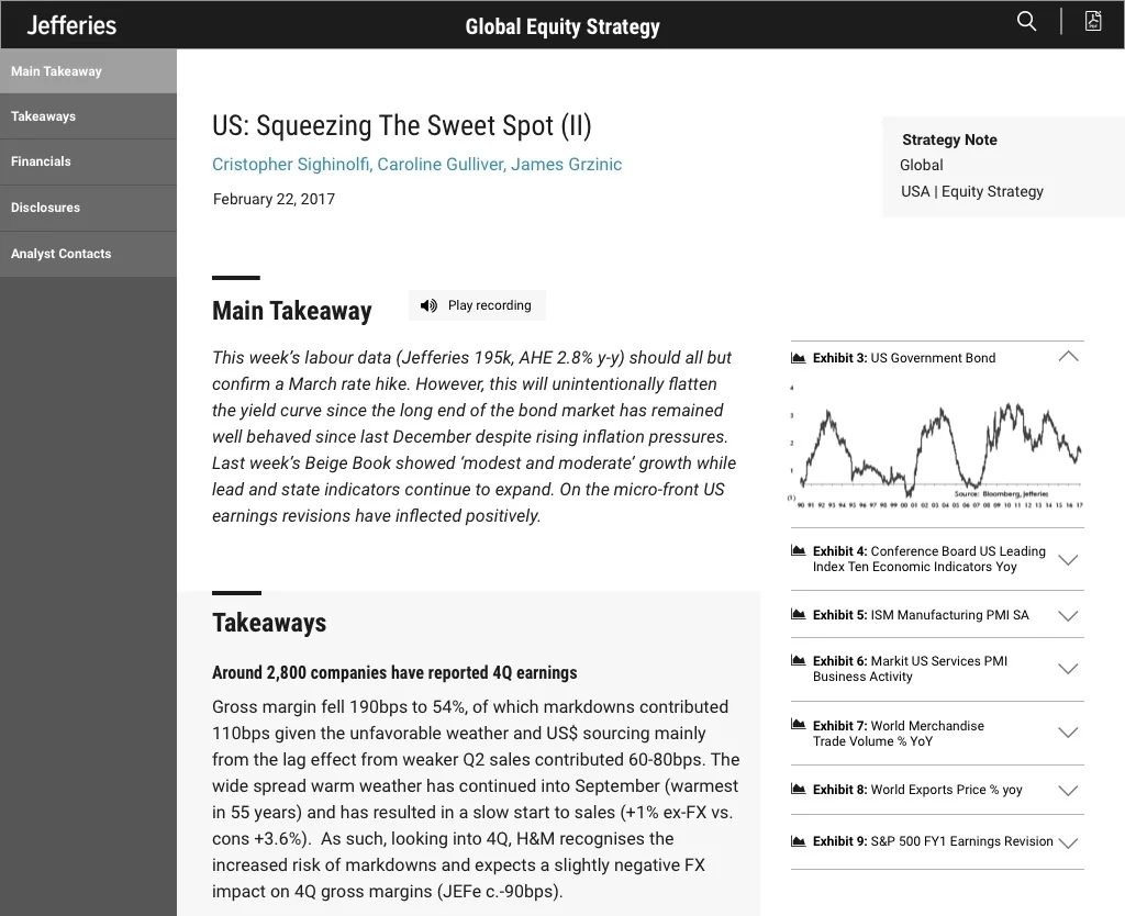
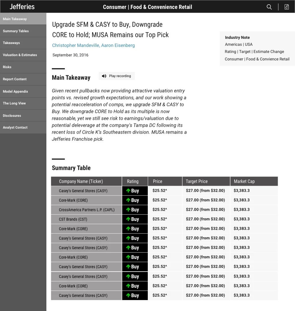
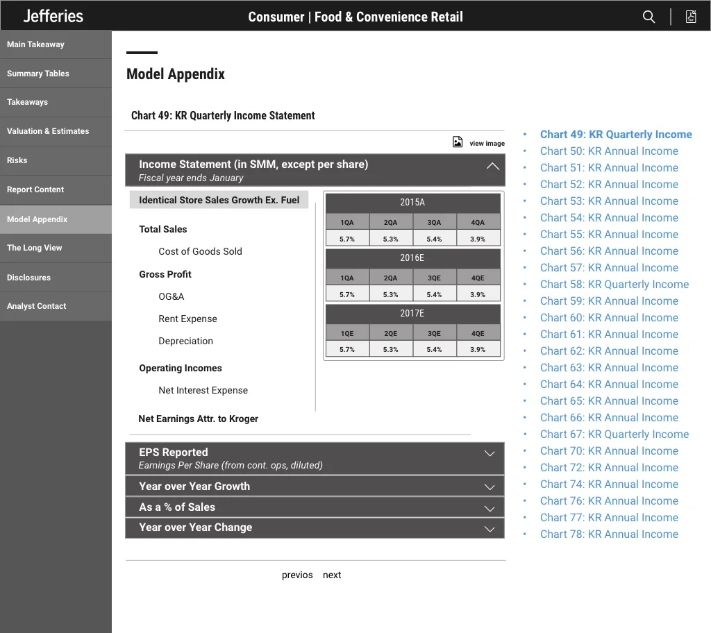
It was a challenge to represent so much information in tables and graphs in a more simple way on html. We also had reports with more than 50 tables like the one below so we needed a way to also find and navigate through these tables easily and interact with them.
Table on the left shows original graphs on paper forms while wireframes display our approach to responsive design of such.


WIREFRAME INTERACTIONS
Some simple motions would sometimes help us communicate our design and features with the client and developers
RESPONSIVE
“Sometimes I am on the subway on my way to work... or I enter a meeting with just my tablet. Can this be responsive?”


VISUAL DESIGN
We presented different approaches to design and color variations once the structure of the wires was defined.
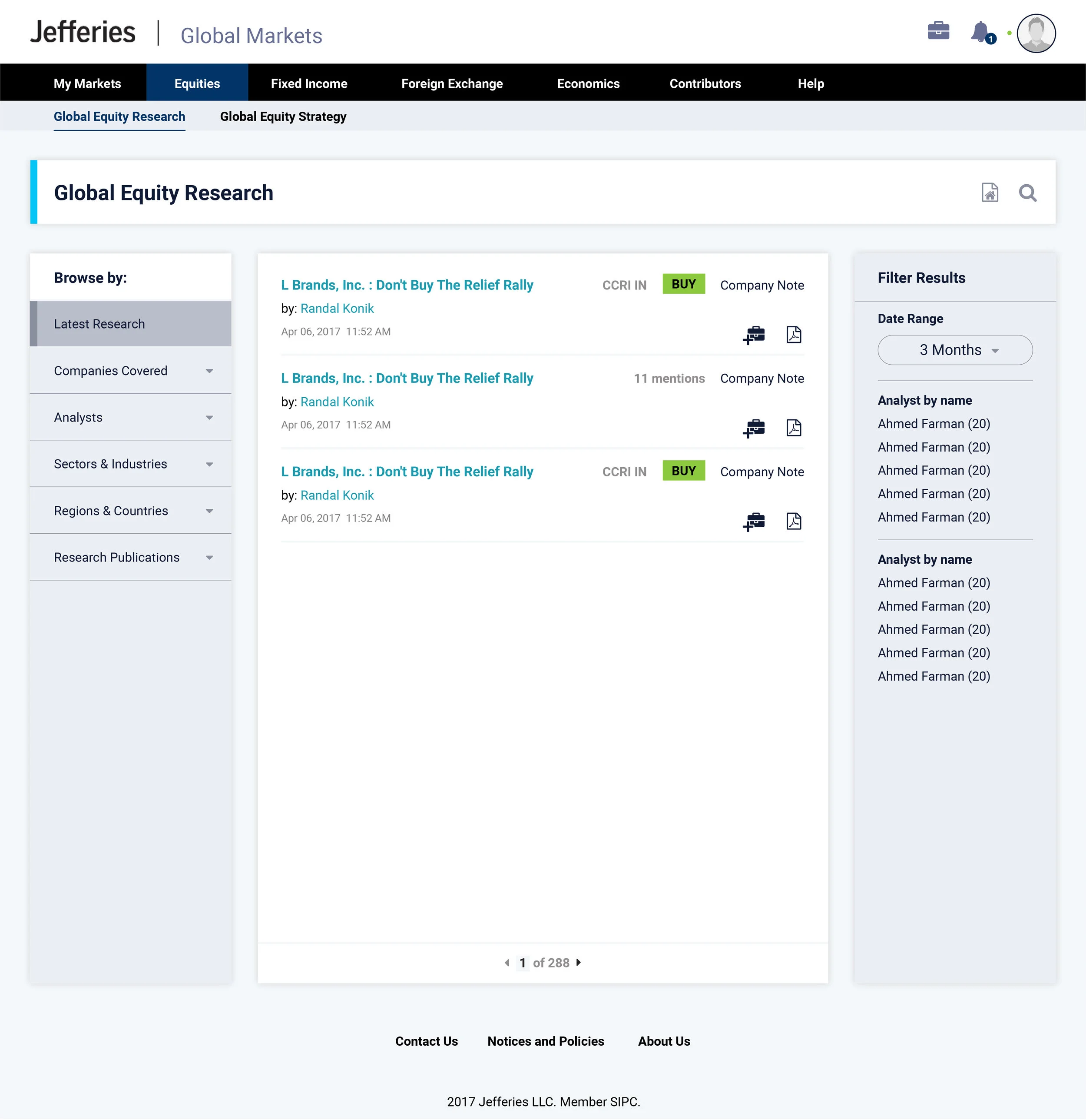
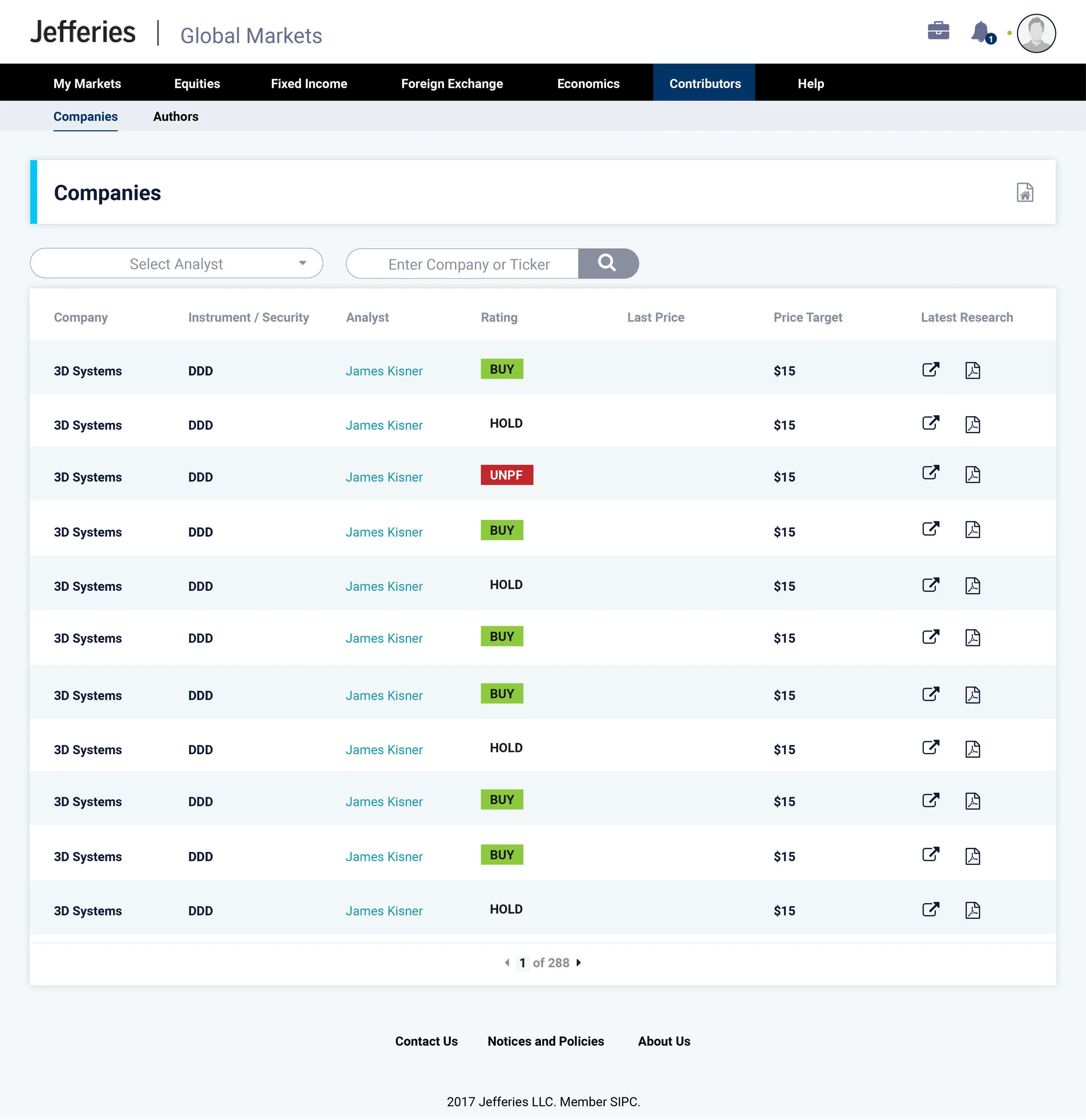
GMS PORTAL REDESIGN
Was tasked to redesign the clients portal.
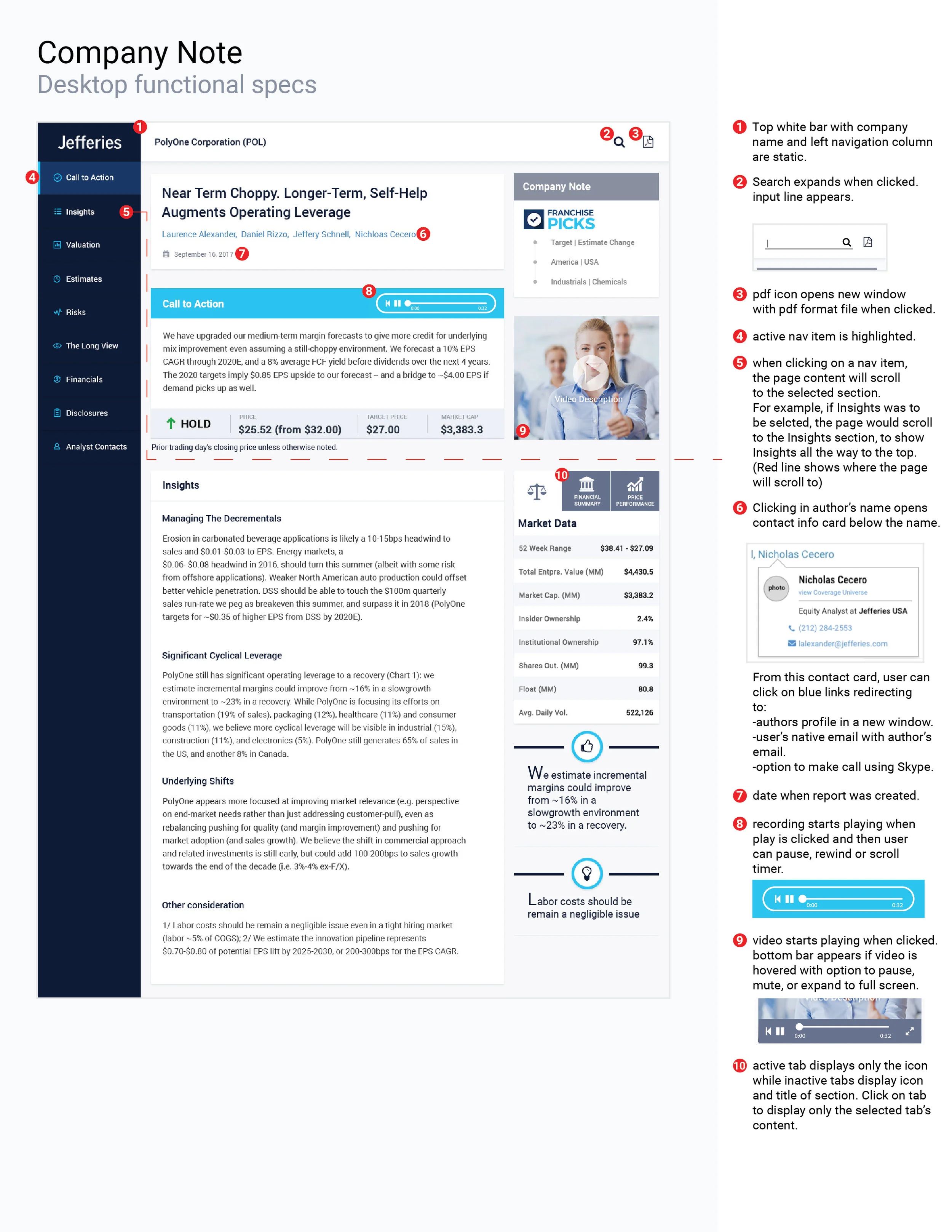
SPECS
Not the most fun of the process but needed to ensure quality and a more efficient communication with development.


There is more to see!

Meal Delivery
How can we take the user to understand the service while also taking him/her to try it and order in a few steps?

Fleet Management
How to help small businesses in LATAM manage and have control of their fleet?