DRAGONX
Excess Insurance platform
DRAGONX is a B2B platform in the excess insurance industry that enables brokers to get quick quotes to deliver to their clients. The platform also includes a workbench for brokers and underwriters to track their tasks and work more efficiently among them.
ROLE
I was brought as a UX Designer with a UI Designer under the leadership of an Art Director.
AUDIENCE
Brokers and Underwriters in the Excess Insurance business.
TECHNICAL DETAILS
We used bootstrap 3 as our layout for responsive design. The project was mainly built using Angular 2 for front-end, Mongoldb for database and Azure as public cloud. Accusoft used for OCR.

How can we automate the current workflow of the business to save users time and help them manage their tasks more efficiently?
CONCEPT ANIMATION
The video below is the fun way to understanding the whole project in less than 3 minutes.

A DAY IN THE PROJECT
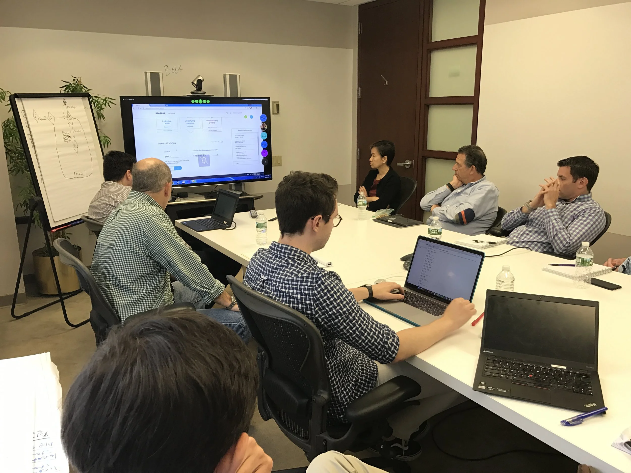
Days consisted of daily scrum meetings, reviewing business requirements and meetings with the client to understand user flows, create wireframes and present final flows with UI executed. During the process, we would work on changes and invite brokers to do user testing and get feedback.

PROBLEMS
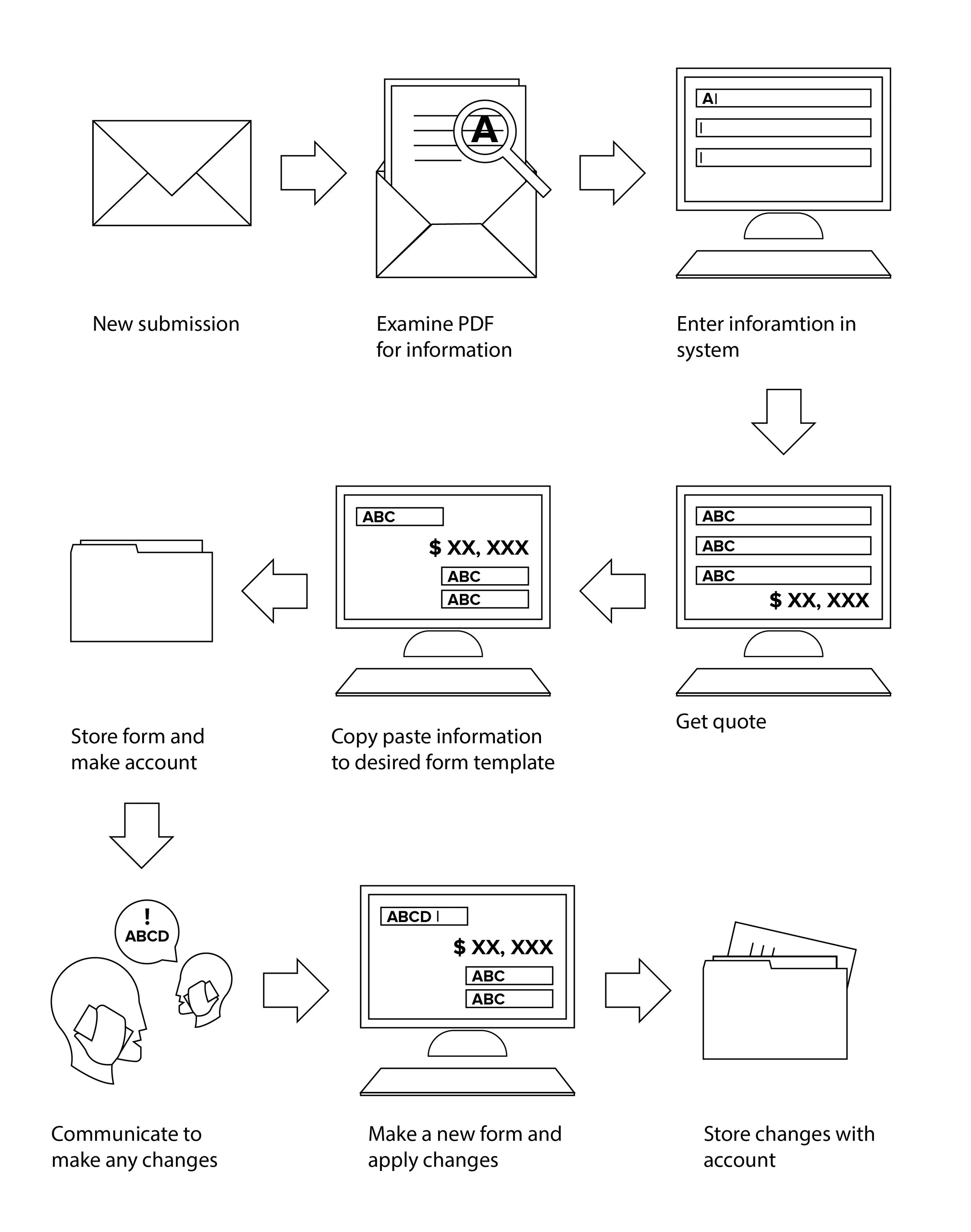
Brokers get all requests from clients by email.
Brokers use different digital platforms (depending on the business to be insured) from providers such as AEG to enter the required information and get a quick quote.
Brokers then proceed to copy and paste all information into their own form formats and store them in their own database.
When binding or making a policy change, for example, there is a lot of back and forth within brokers and underwriters and not a seamless and complete process through one single platform.
SOLUTION
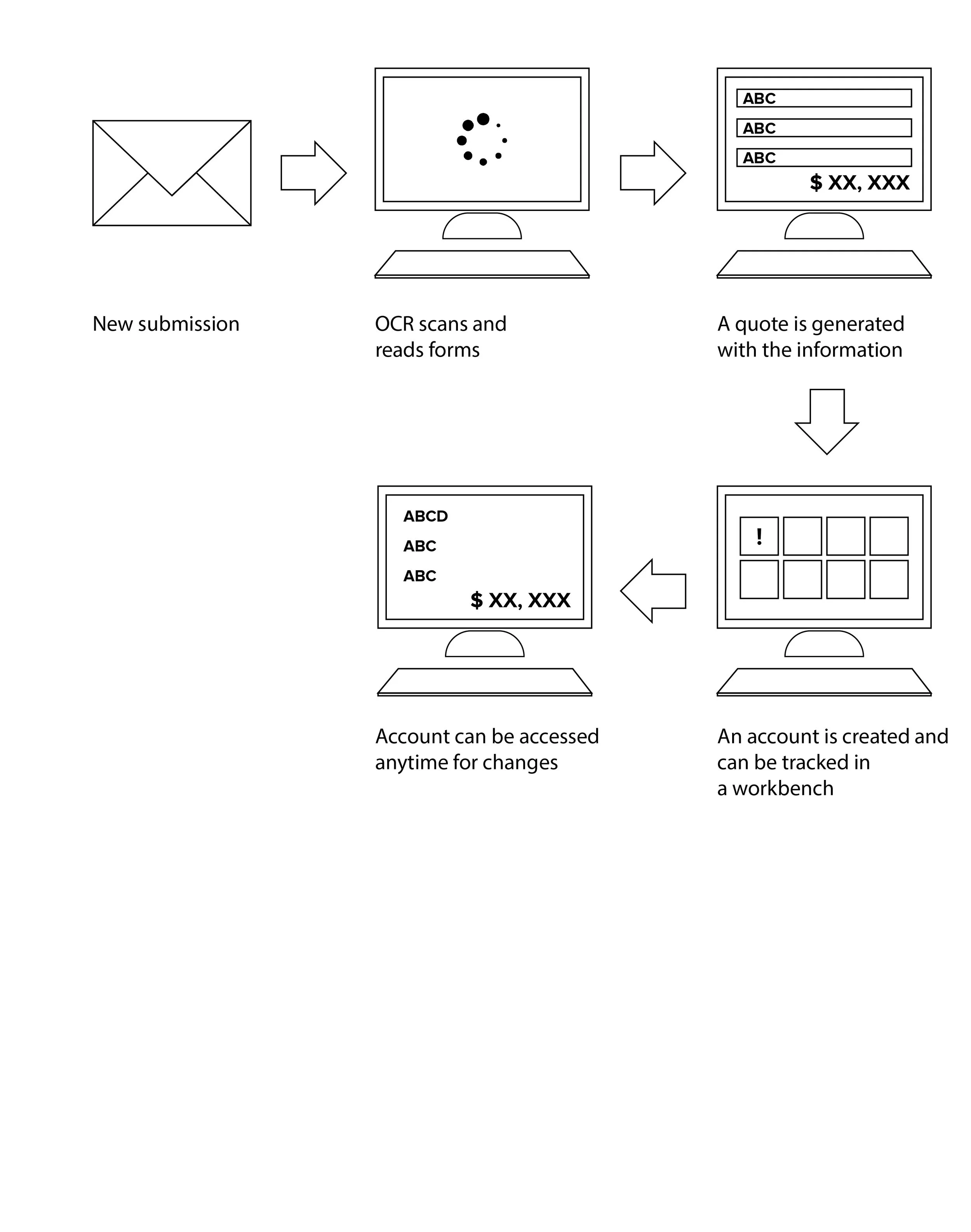
Allow brokers to seamlessly transform their submissions received in their email into a quick quote.
Enable them to keep track of their accounts through our platform.
Enhance and reduce broker and underwriter communication solely through the platform by giving self-service to the broker and specifying problems more directly and in detail to the underwriter.
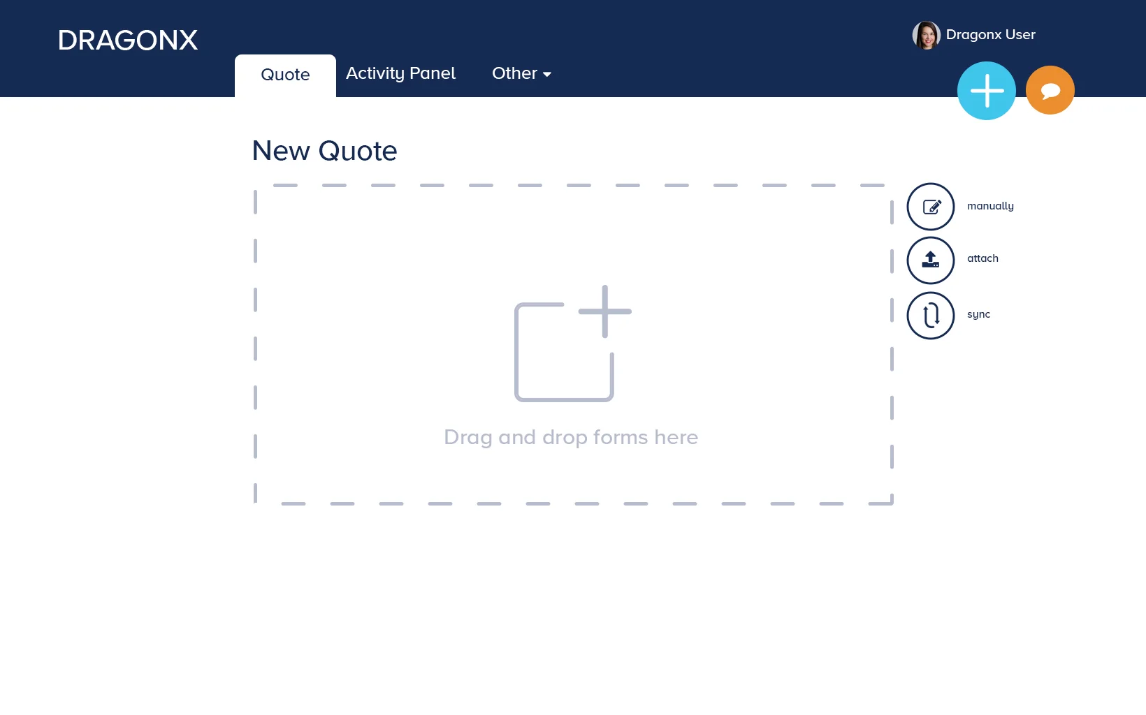
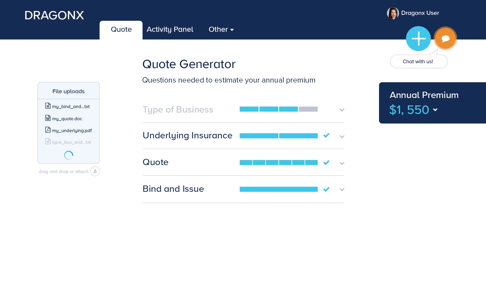
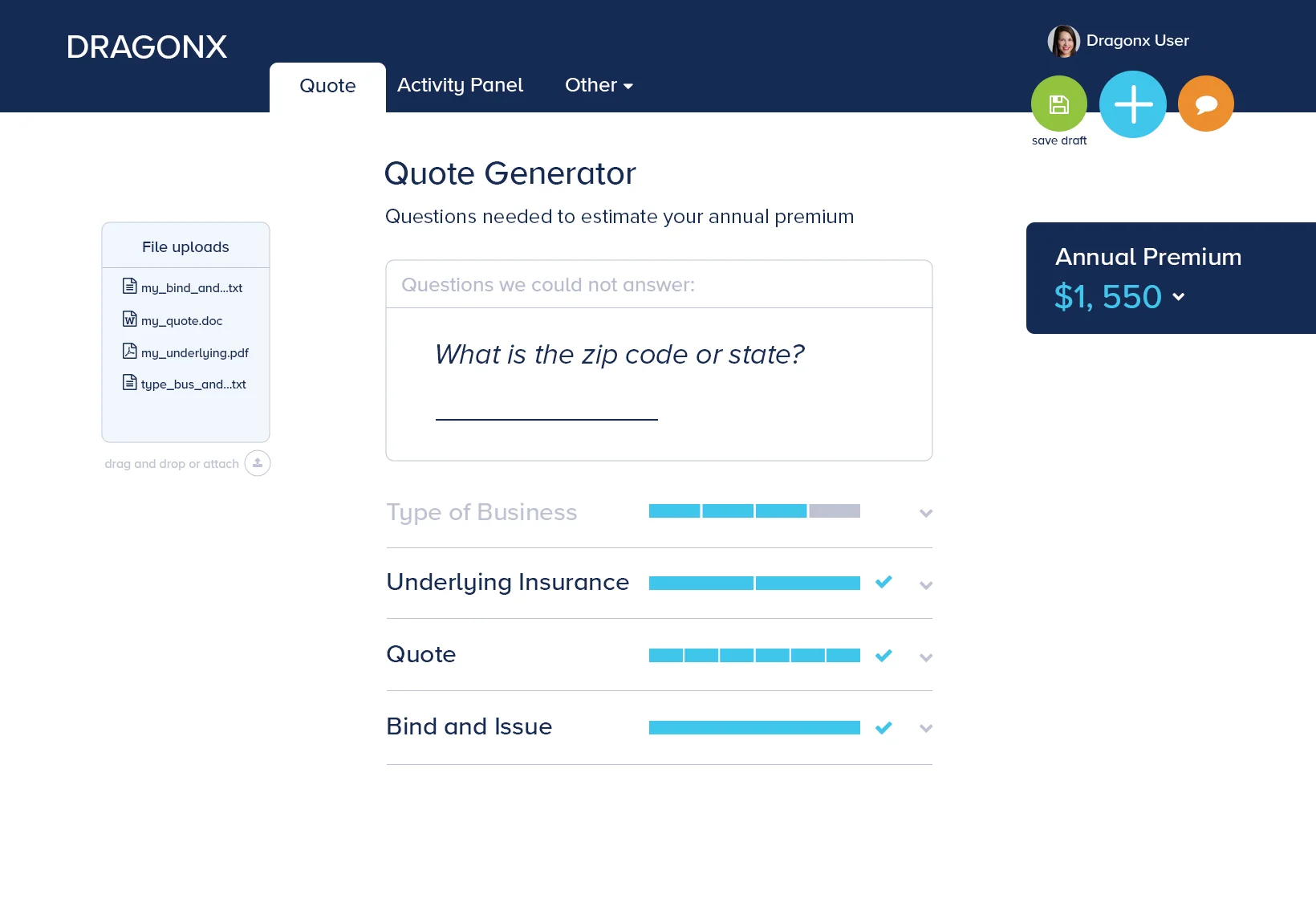
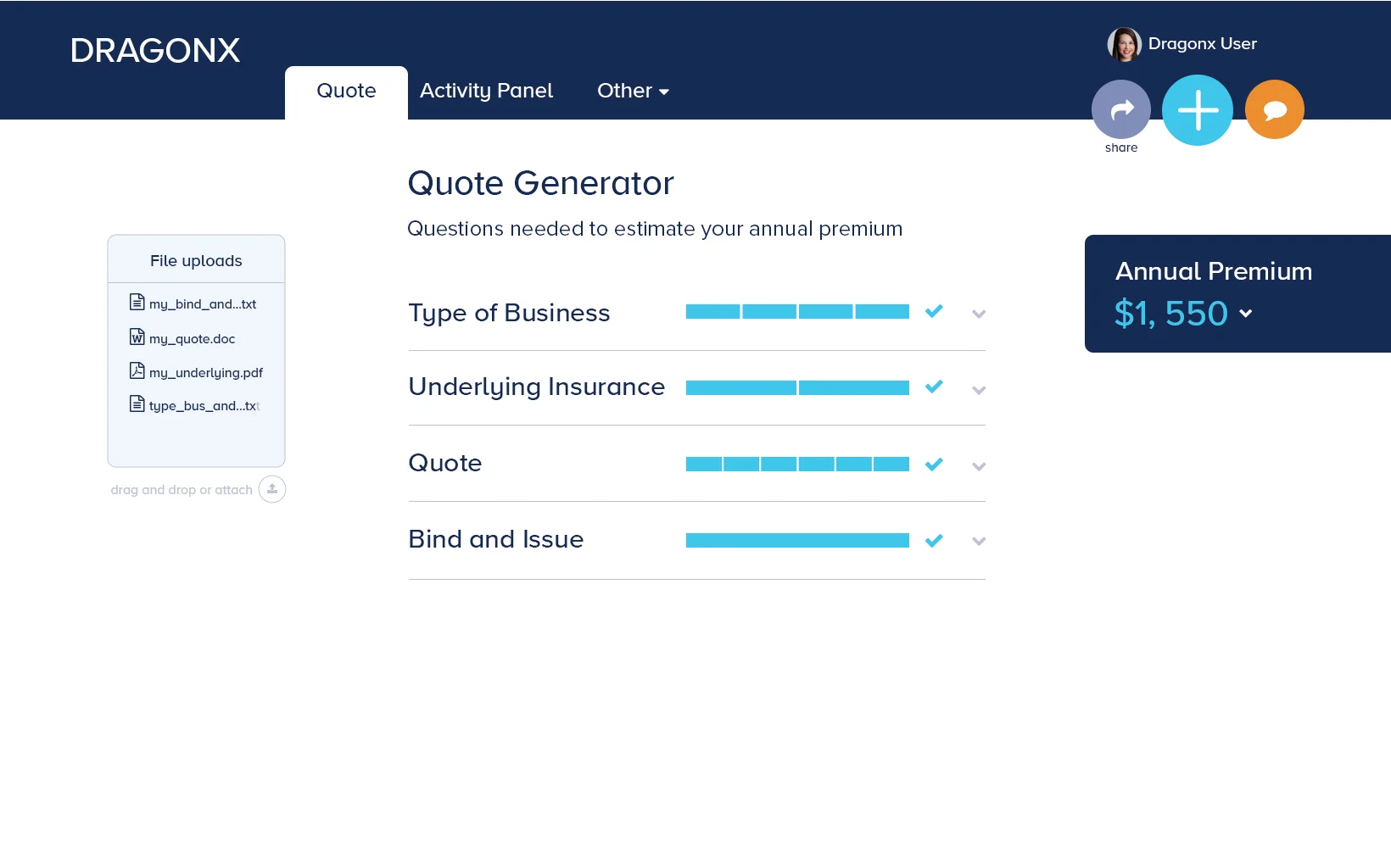
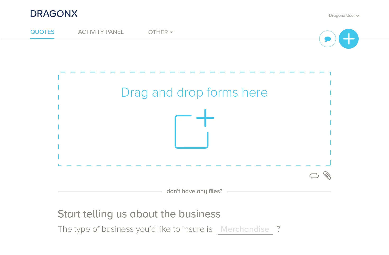
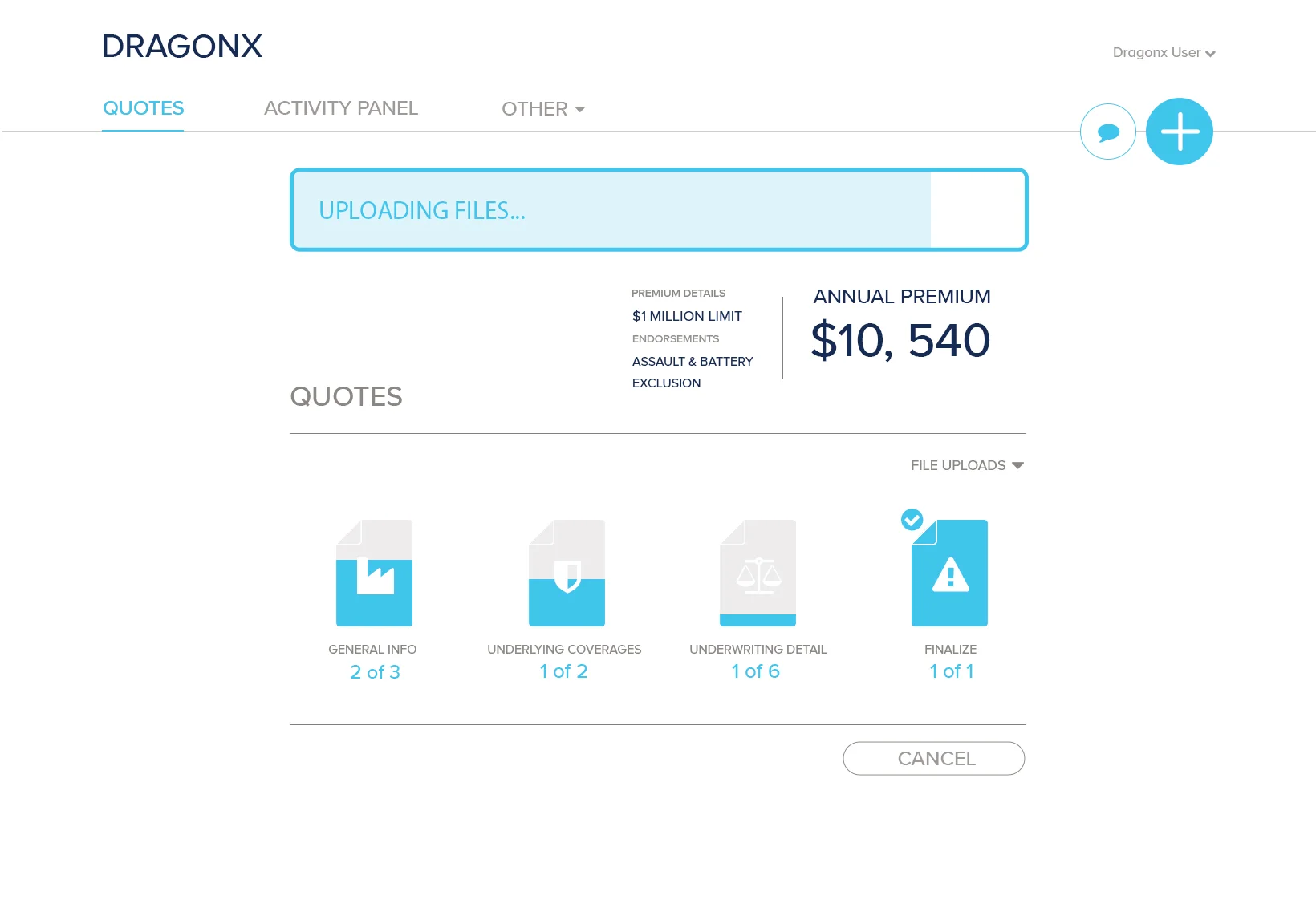
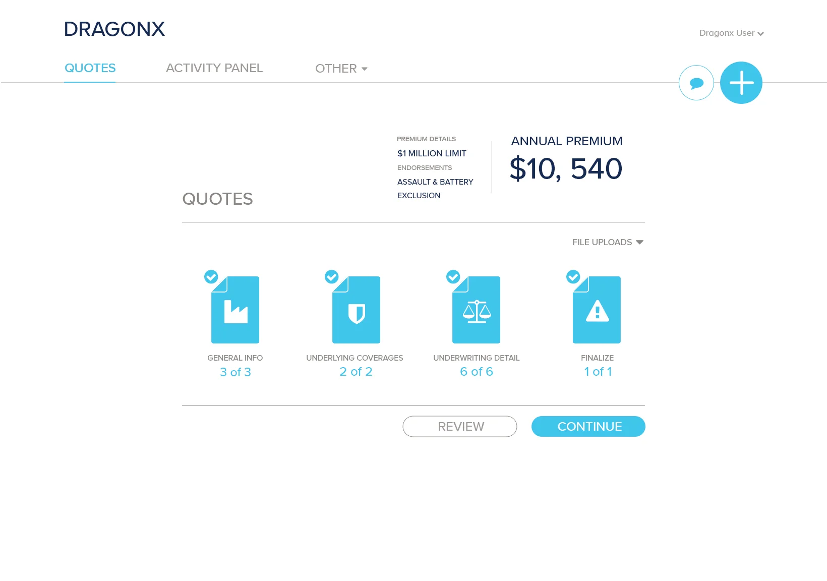
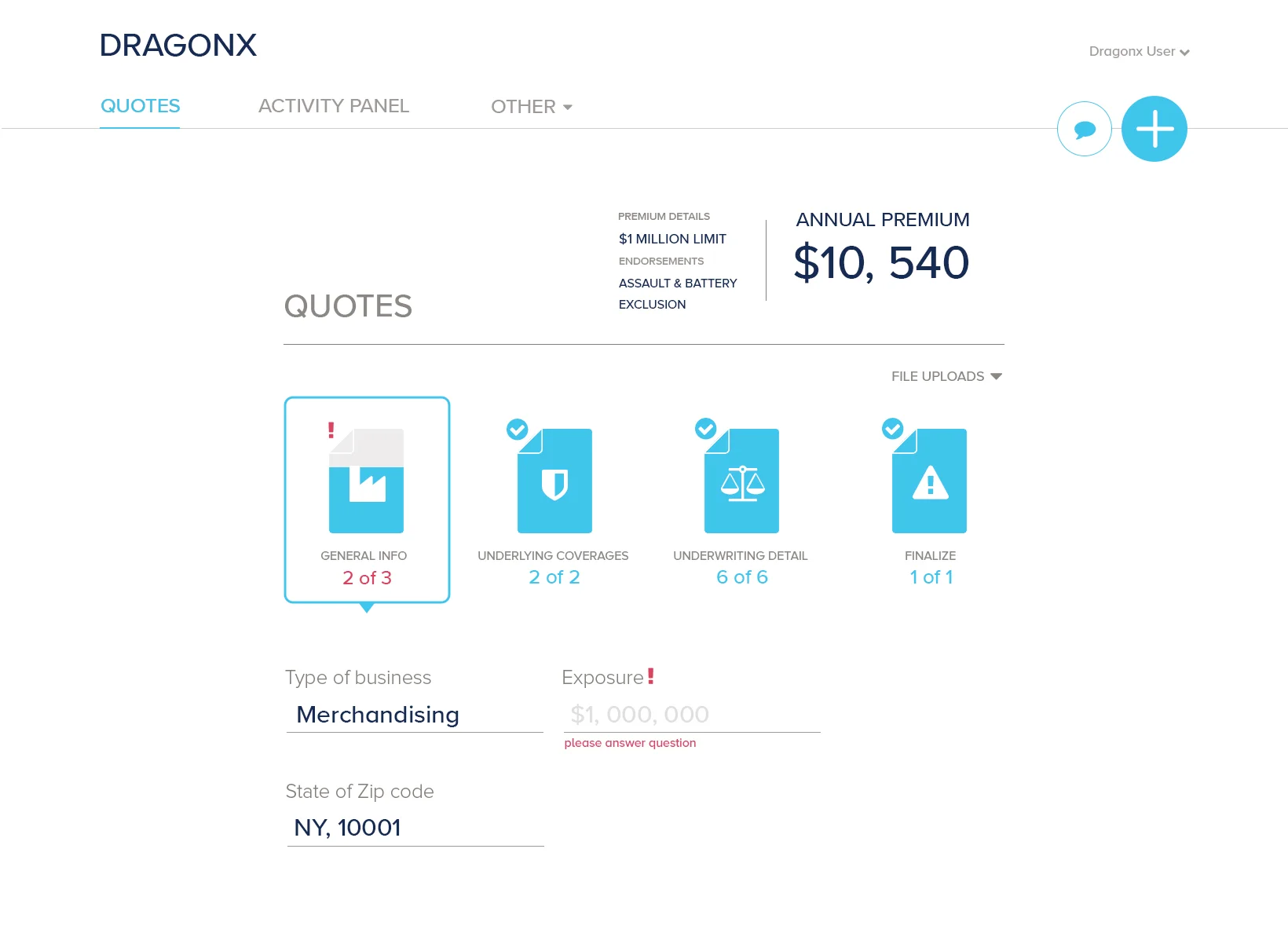
FORM STAGES
As a submission is received, certain information from the forms is needed to give a detailed estimate. The least of the information provides an indication and a quick price estimate. As more questions are answered, the system provides a closer estimate. Once all questions are answered then the user can get a full quote which can be later bound into a policy.
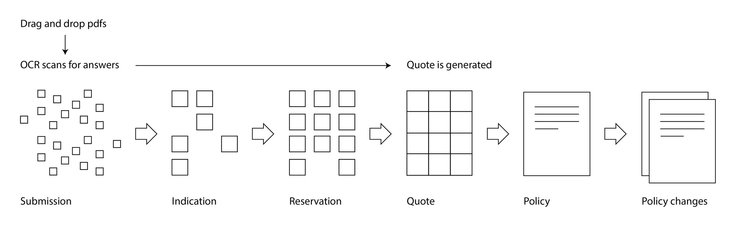
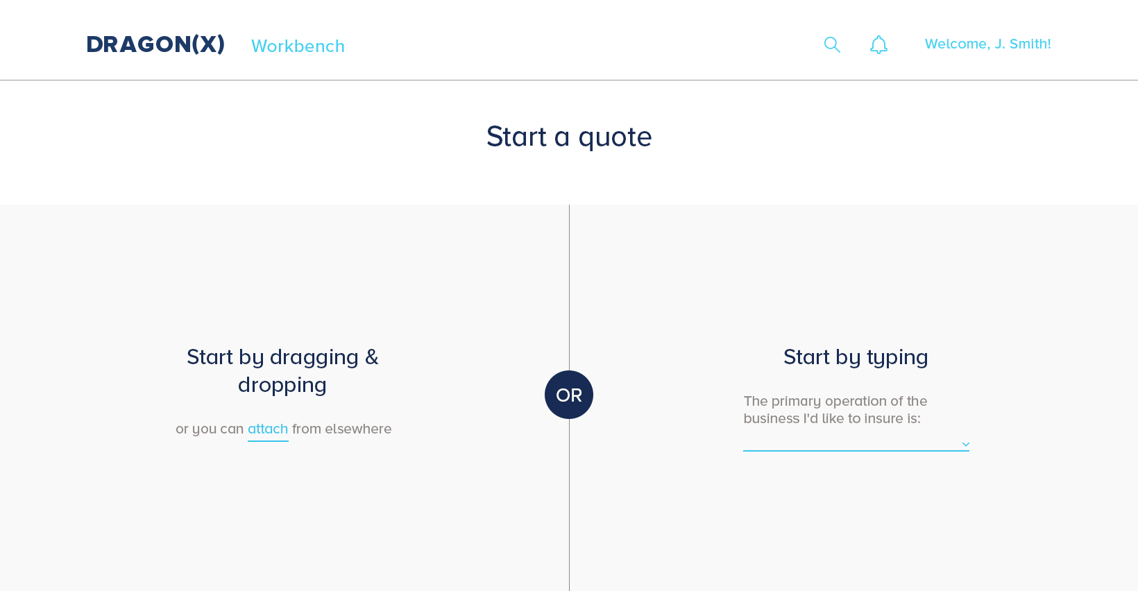
USER FLOW TO GET A QUOTE
Broker signs in and can start a quote by dragging and dropping or attaching files but also by manually entering the information. Once all information is entered then the the broker can proceed to generate the quote.
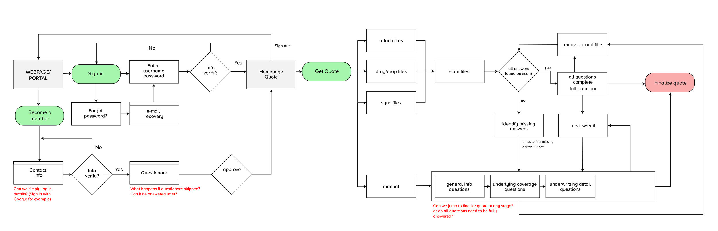
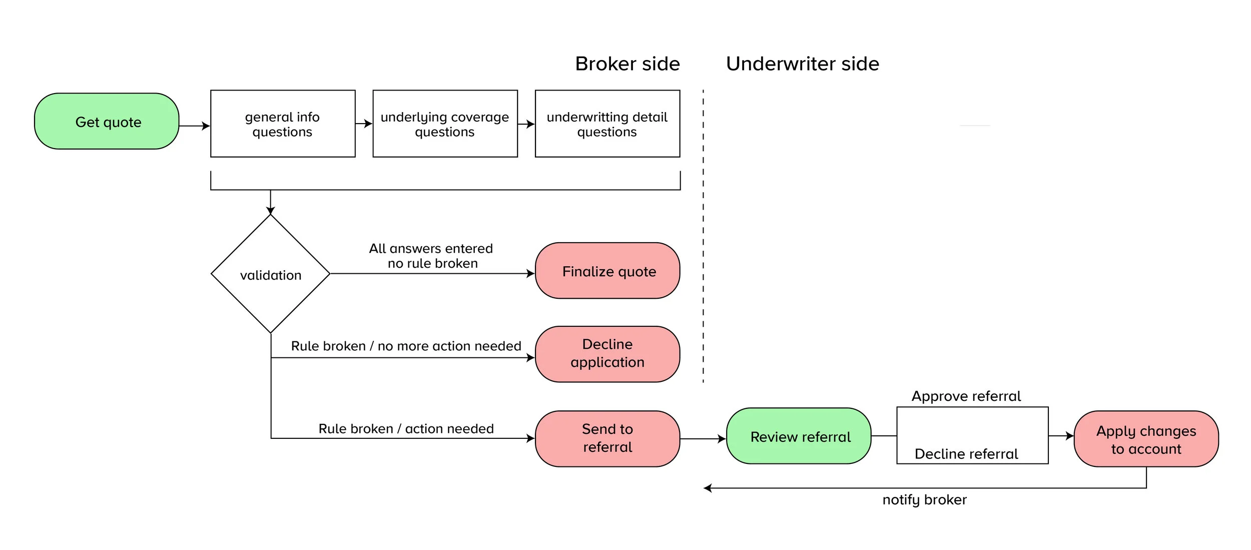
USER FLOW BETWEEN BROKER AND UNDERWRITER
During the application process, an answer can trigger an application to be declined or referred because it might not fit the business appetite or might need further review from an underwriter to make sure everything is alright.
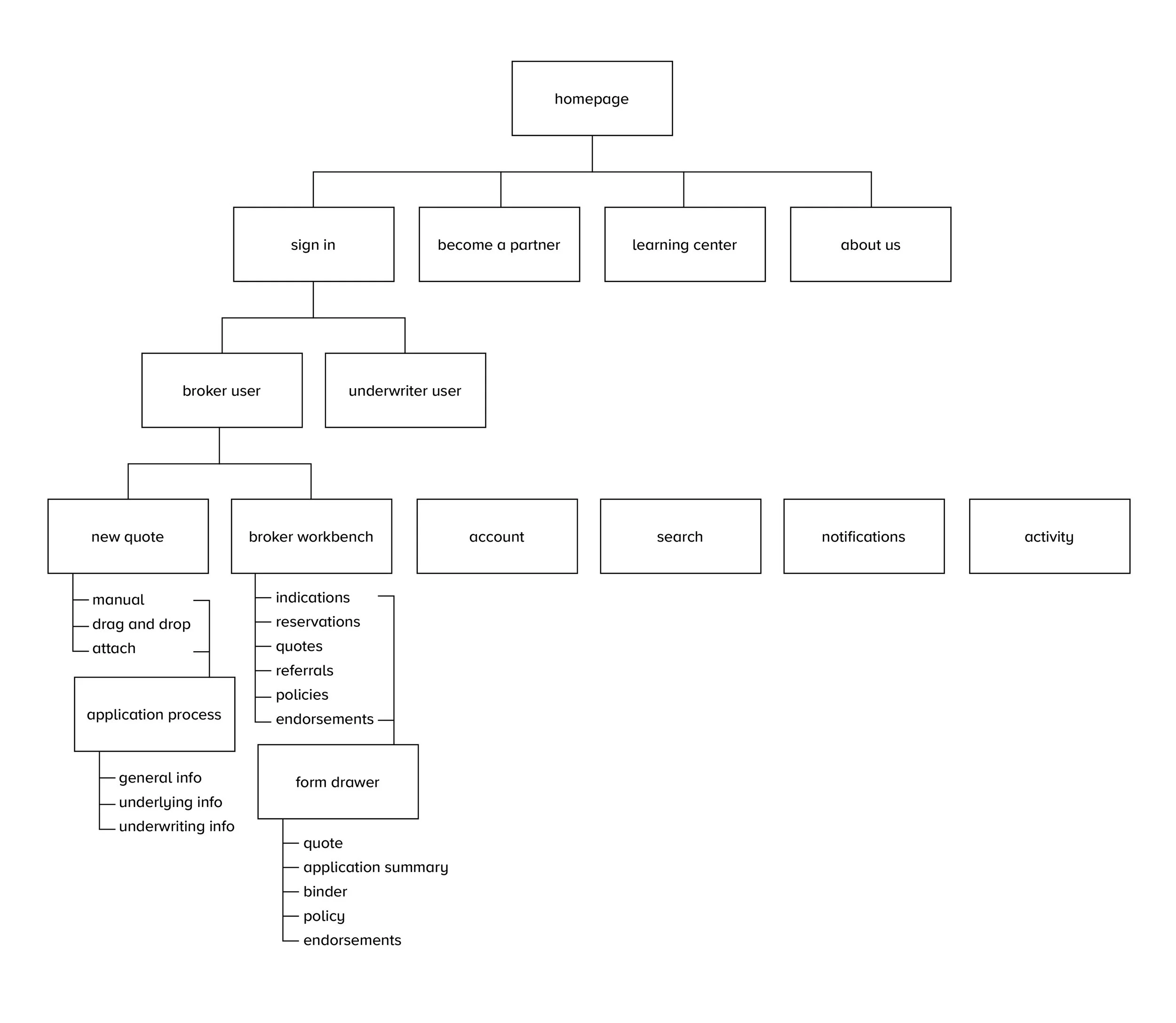
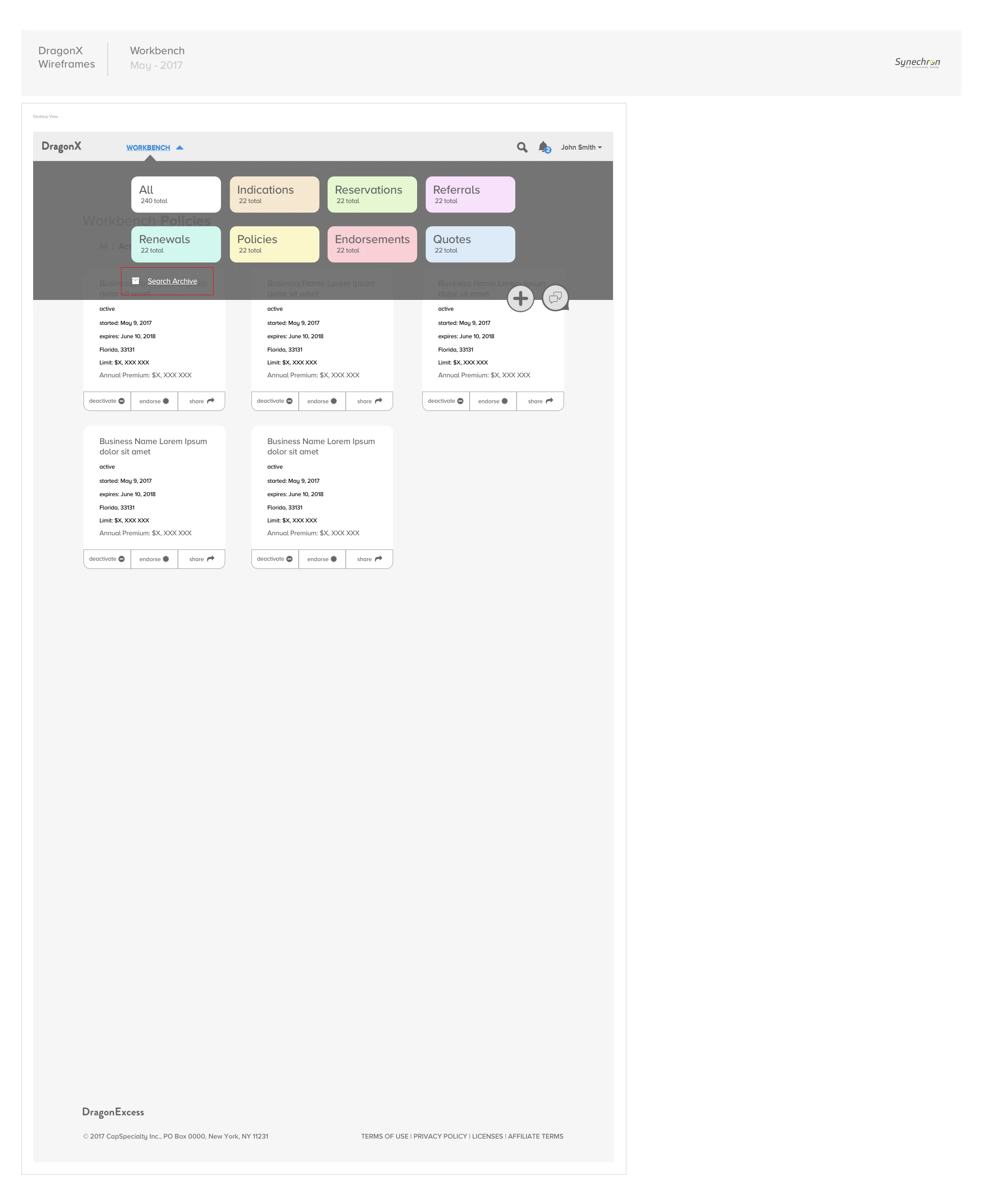
SITEMAP
The initial sitemap consisted heavily on the broker side to get a quick quote and continue his tasks through the workbench. A form drawer was a solution to store each account's information and forms.
INITIAL UI APPROACHES
We presented different visual approaches to the client to establish a design language. The client leaned towards the design on the right as users were reading right to left steps in the application better and they also preferred the bright blue and more clean white mood.
PRODUCT INSPIRATION
We used inbox from Google to understand how content the user receives can be smarter with one click interactions the user would most likely want to do and also displaying enough information for the user to understand what the content is all about without the need to access it.
Trello inspired some approaches to how we organized cards and interactions with the content in them.
Invision inspired some features such as the history and the way activity is tracked.
HiOscar uses natural language to give the user an estimate very quickly with few questions.
Other products such as Amazon, Pinterest, Nixon were used to understand their product pages and how they handled product content.


RESEARCH
I would spend some time, usually in the morning to research and try to find best approaches when designing. I recorded some of the research articles I found while designing some major features.
Dashboard:
http://www.designyourway.net/blog/inspiration/showcase-of-beautiful-dashboard-ui-designs/
https://www.invisionapp.com/blog/designing-better-dashboards/
Floating Action Button (FAB):
http://blog.usabilla.com/floating-action-button-bad-ux-design/
https://uxplanet.org/floating-action-button-in-ux-design-7dd06e49144e
Nav Menu:
Search:
https://uxplanet.org/mobile-ux-design-user-friendly-search-51e5f78f5a1e
TRANSITIONS AND MOTION
The broker started by having options to get a quote, manually entering information was one of them. We used different approaches along wireframes to explain some of the transitions to the client and development as the example below.

UNDERSTANDING BUSINESS AND INDUSTRY REQUIREMENTS
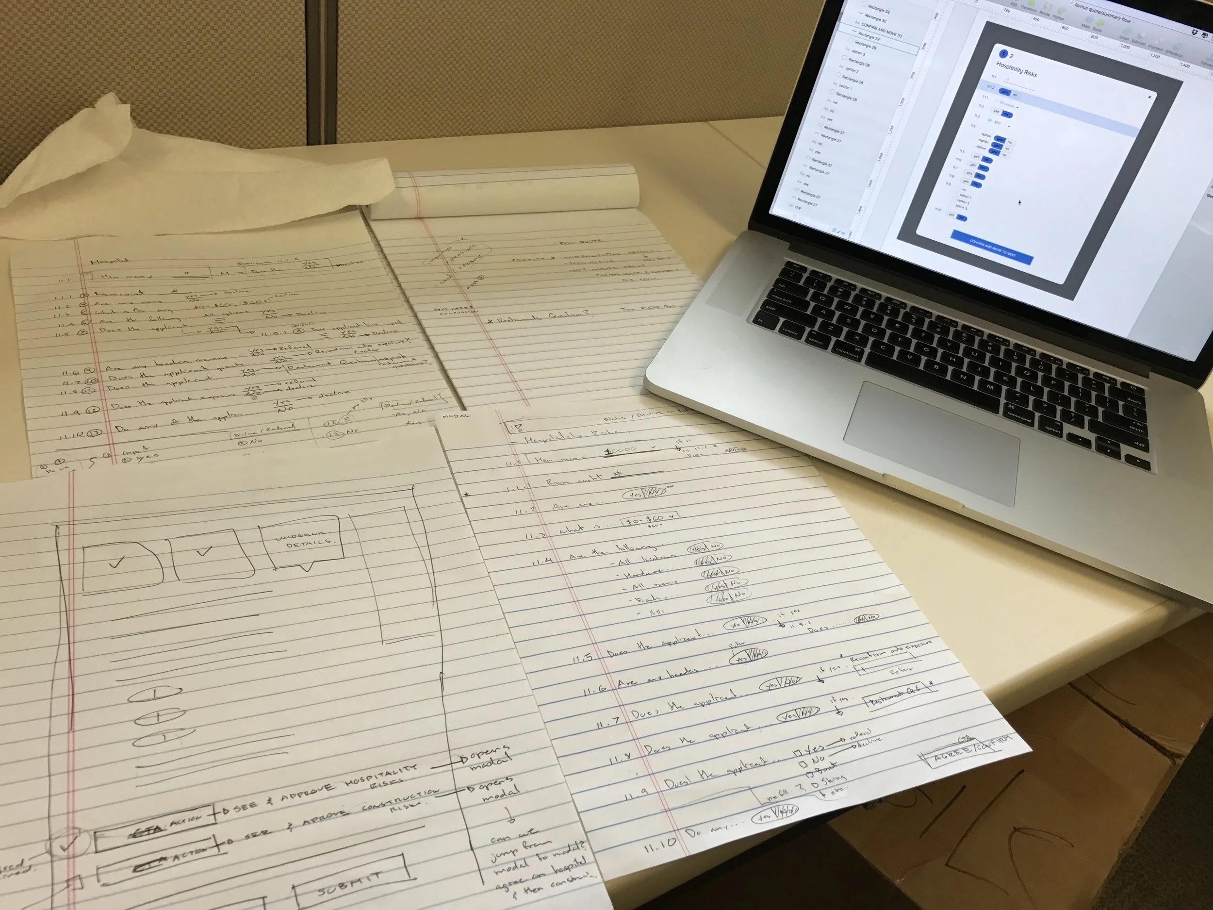
We would sometimes get excel sheets with the rules of what questions we needed to ask and what the result of the answer would trigger. As the project went on, we had to add or change questions so it was up to us to try to keep the experience for the user as quick as possible with pre selected answers that would save them time.
In this example, we needed to add industry related questions which were a lot and did not want to elongate the page so decided to do an overlay with default answers that the user could quickly confirm. Certain answers could trigger a declined or referred application as we marked.


WIREFRAMES
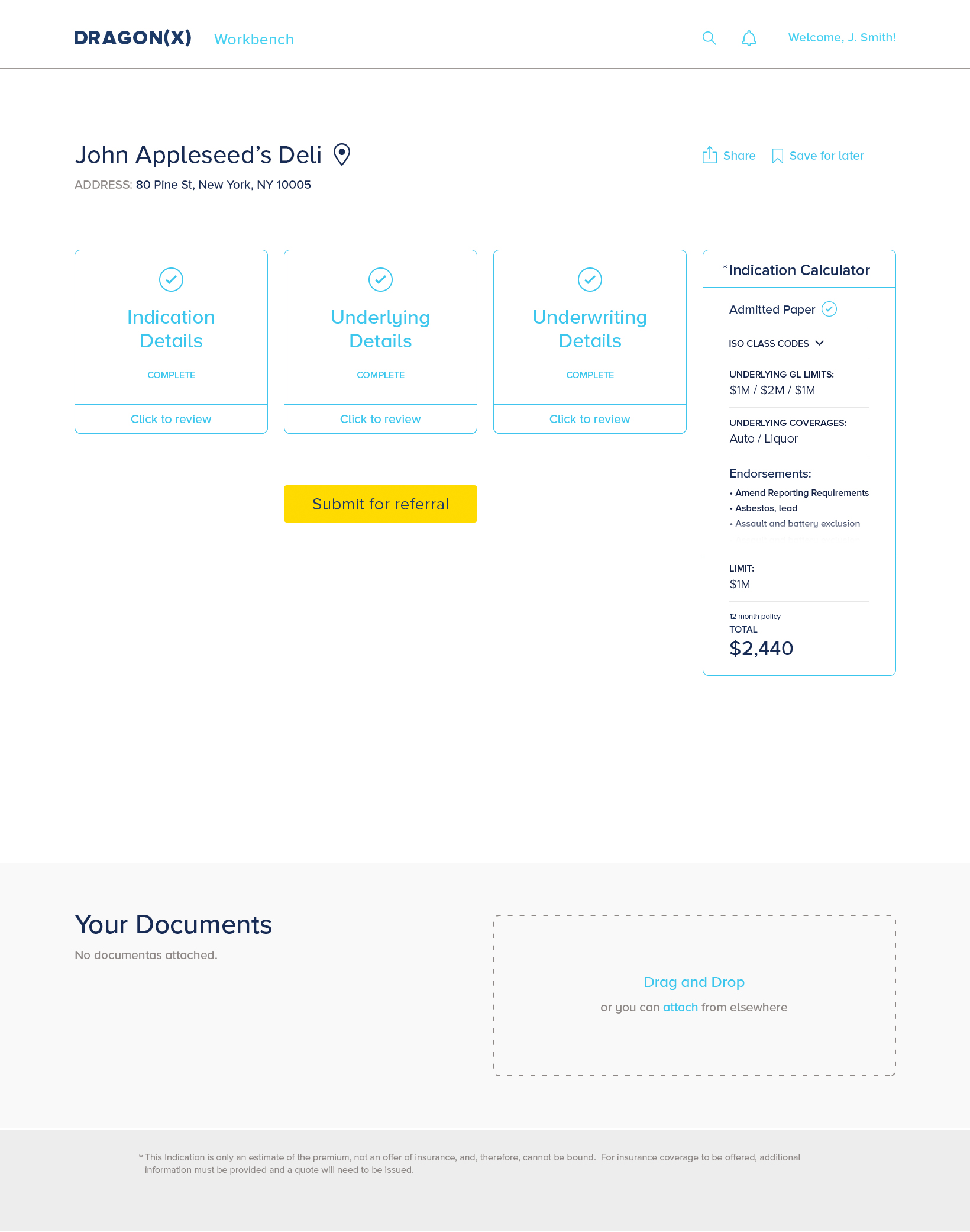
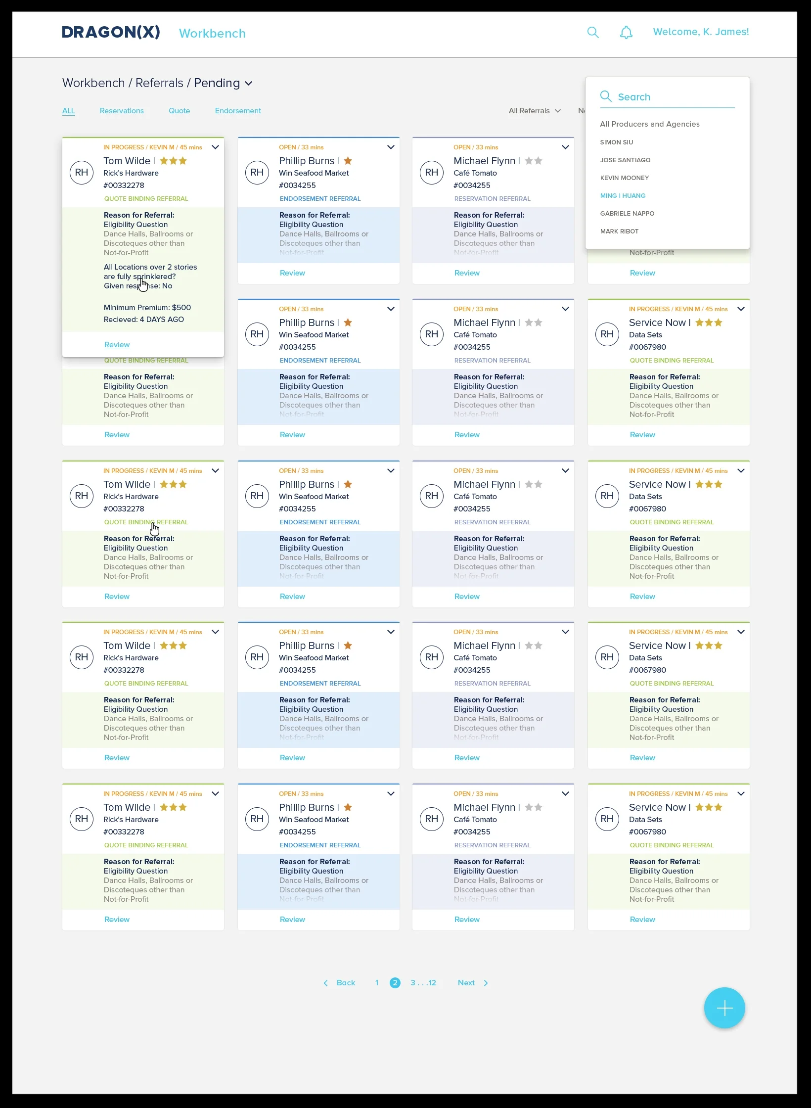
Using the Dashboard as an example, we used different approaches to understand what and how much information the user needed right away and what interaction was right to display. We divided the dashboard into sections relating to the different stages of the application. A card would be moving from sections as its status changed. For example, a broker would see a card on quotes section and when the quote is bound to be a policy, the broker would then see it displayed as new under policies section.


FORM DRAWER - BINDING FLOW
Every account has a place where all its information and forms are stored. The digital form drawer works just as a person would originally store paper files in a physical folder and then in a drawer. In this example, I show the flow of how a broker can bind a quote to generate a policy.


PAPER TO DIGITAL
We transformed paper forms into digital and interactive forms.


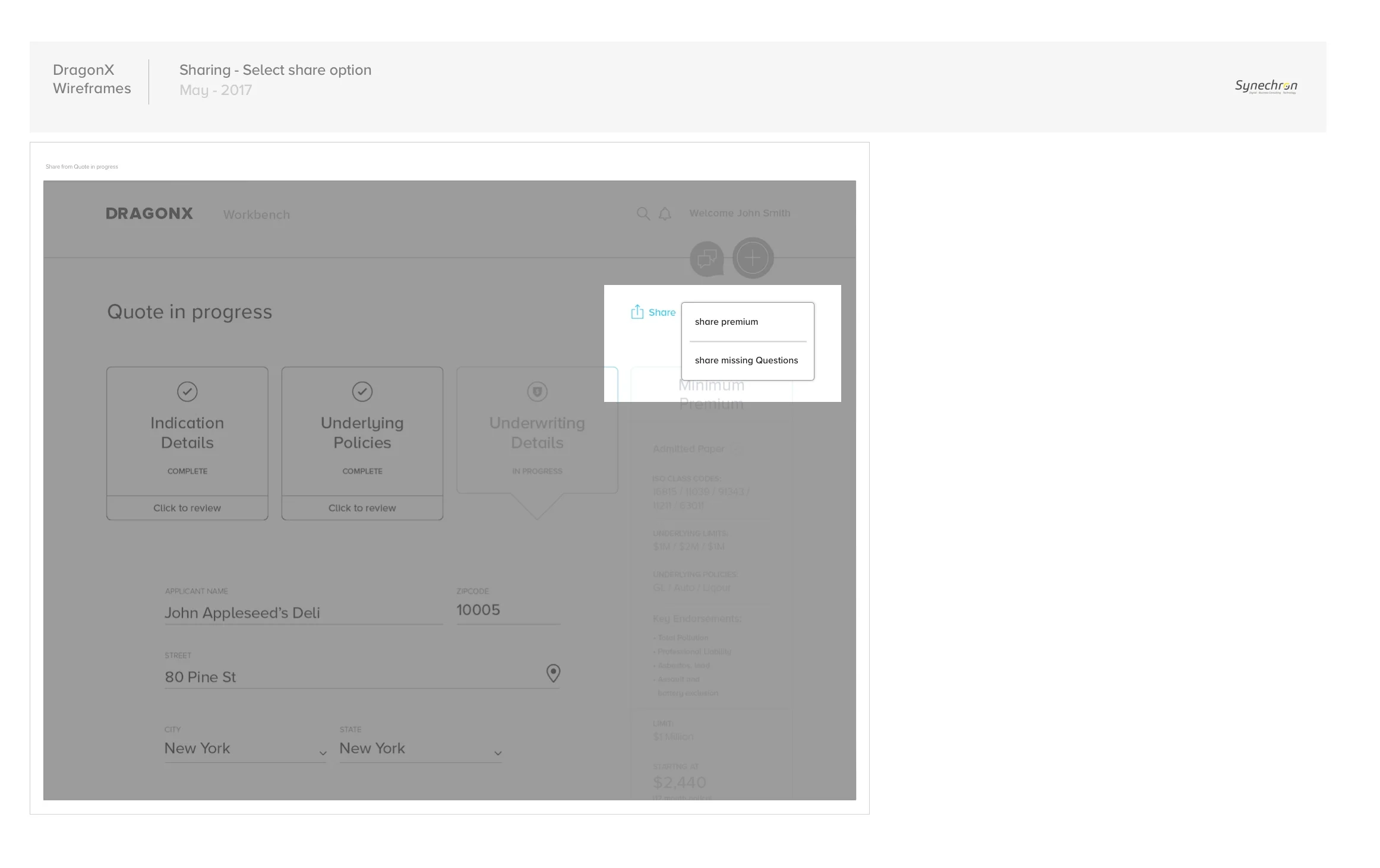
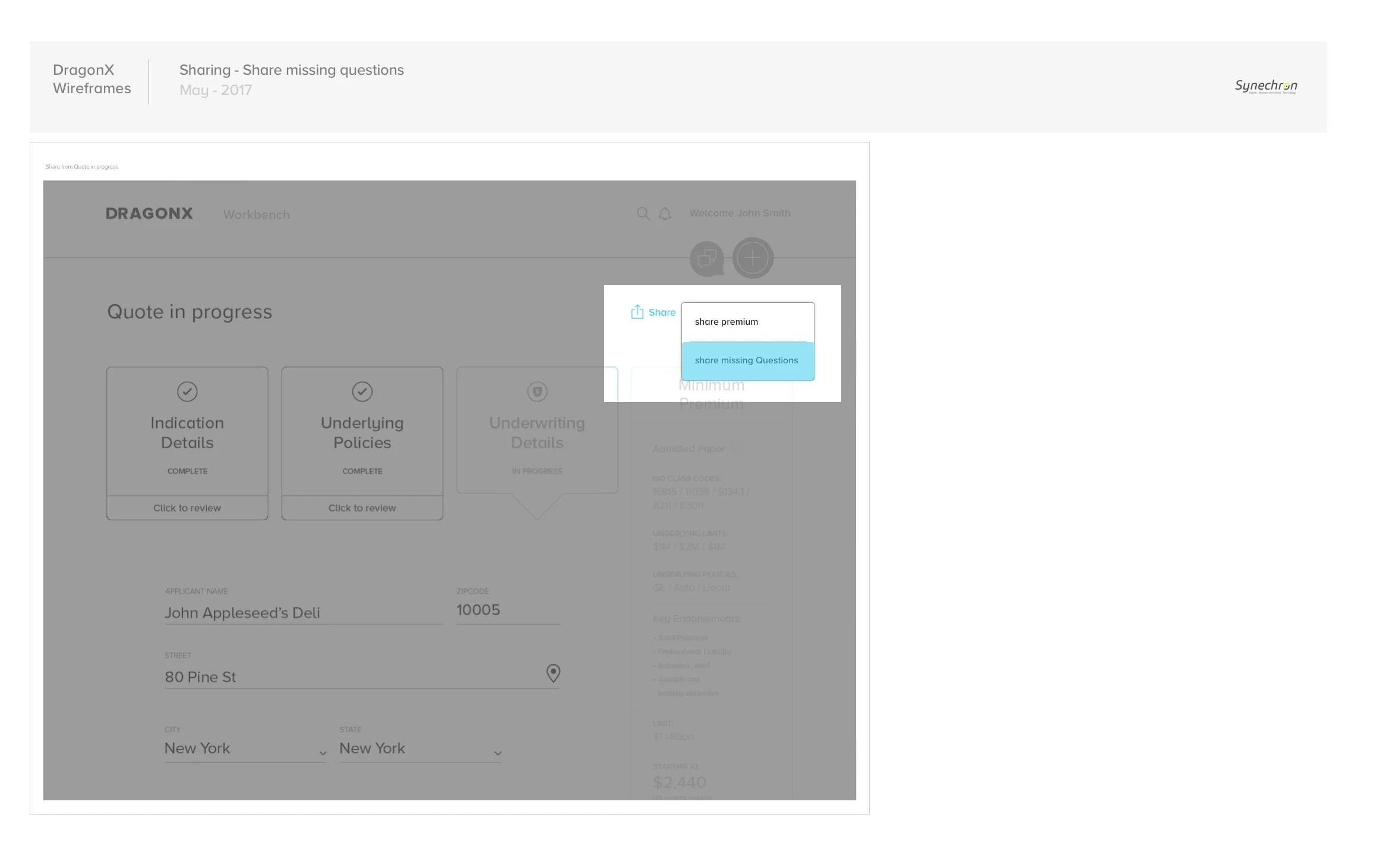
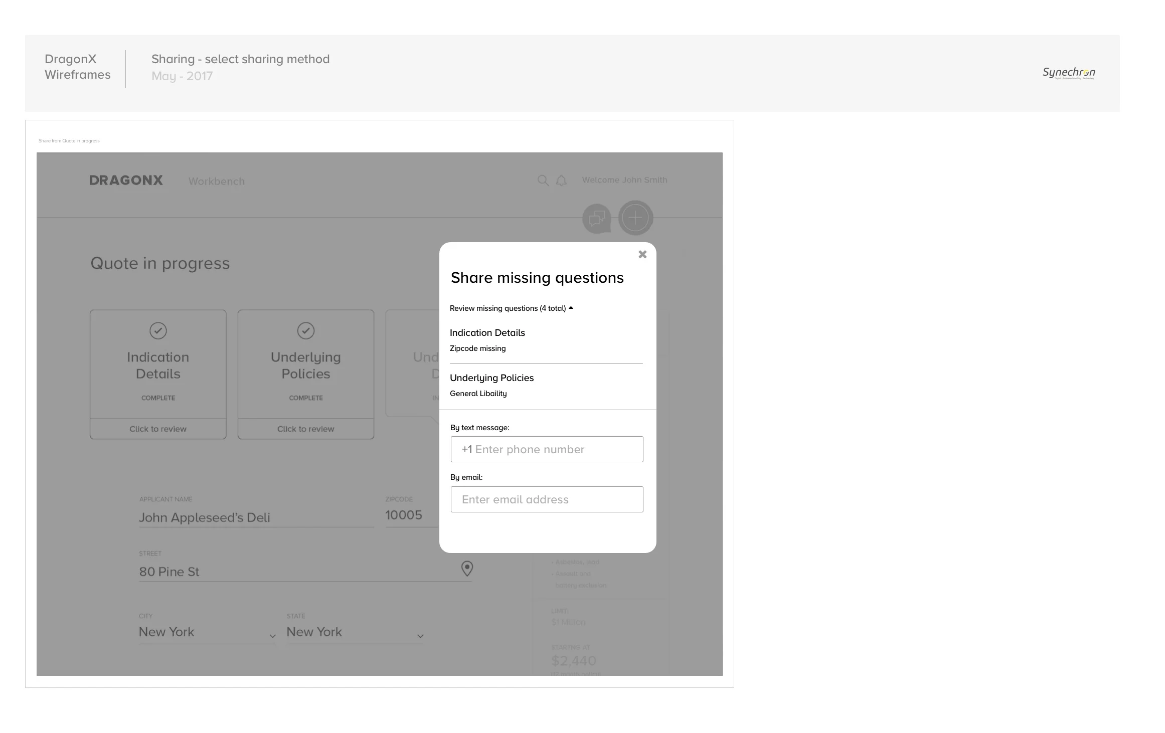
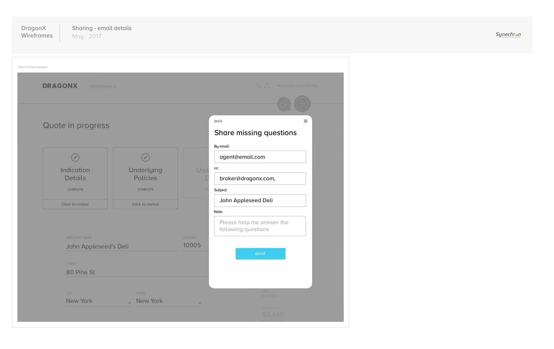
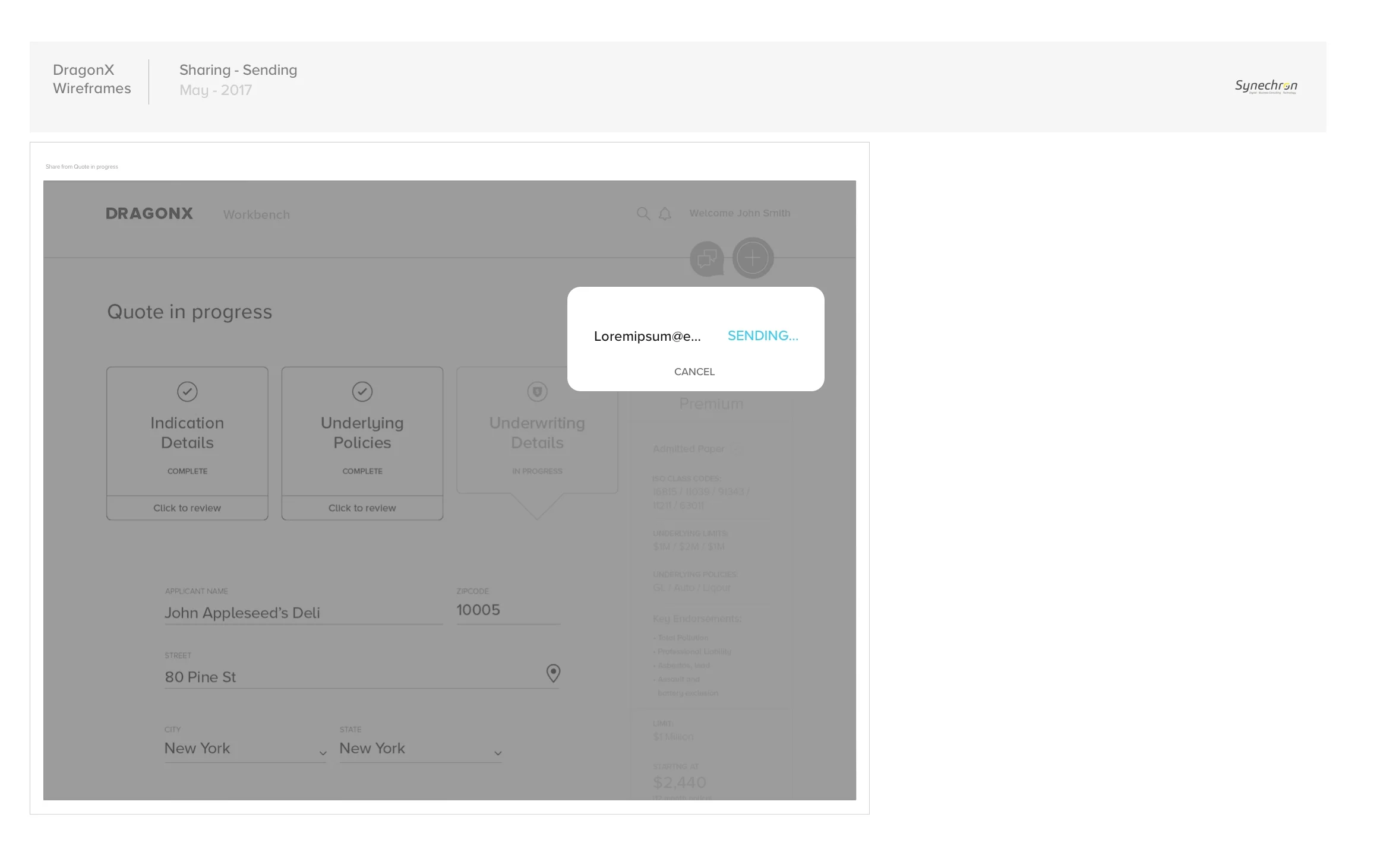
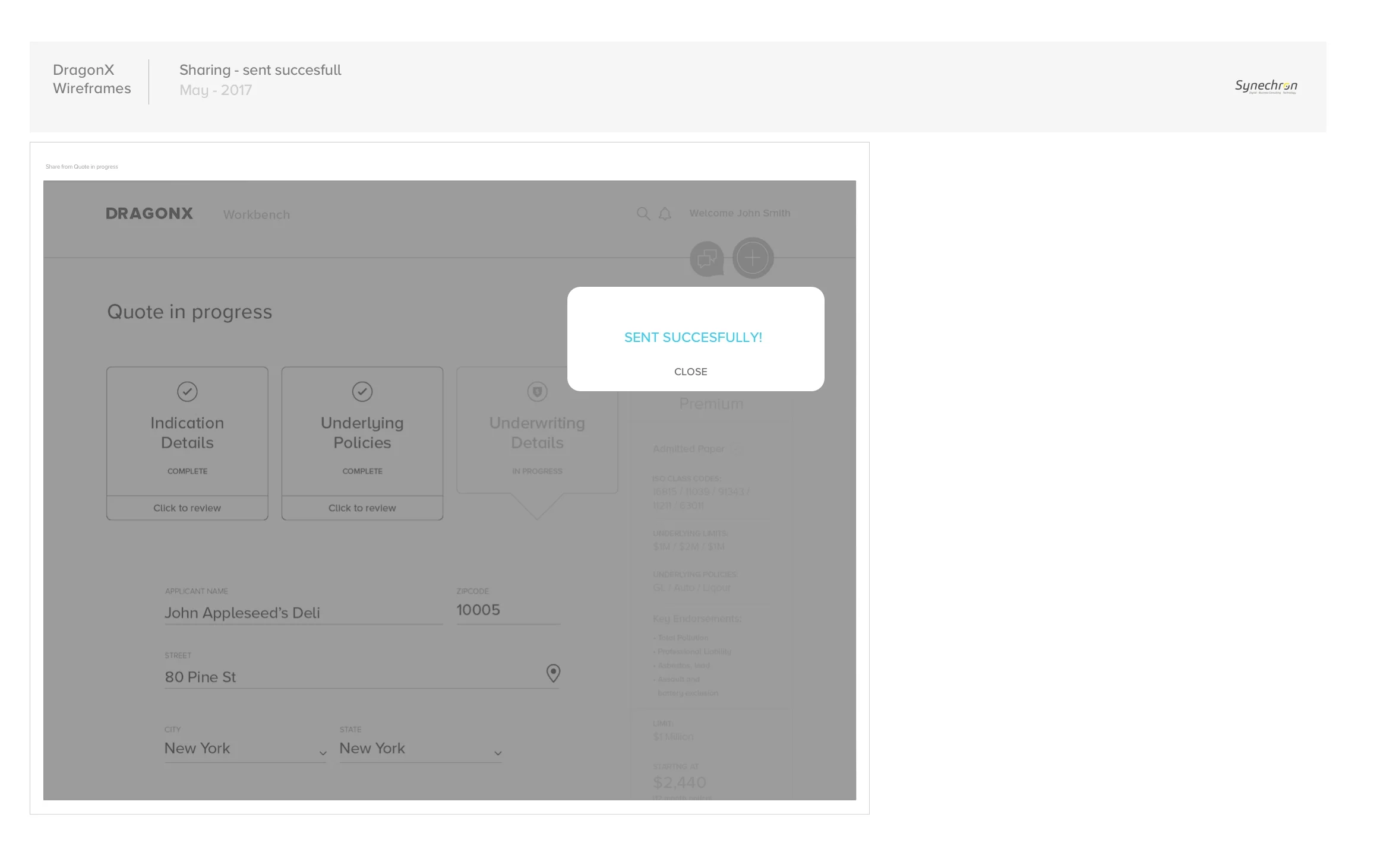
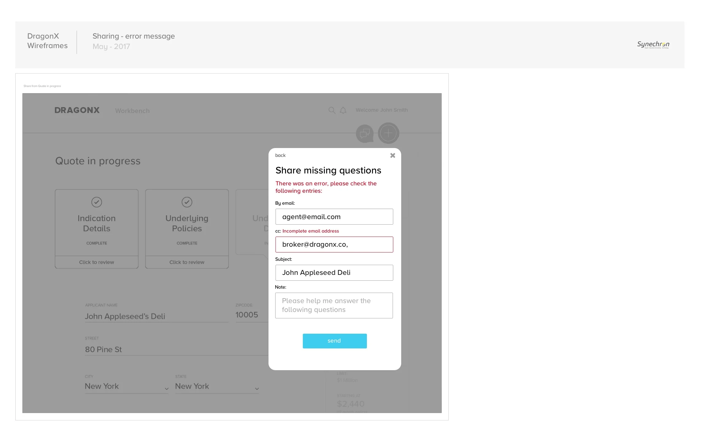
SHARE FLOW
In this example, I show a simple flow of the sharing feature. We worked on what was needed to be shared and we discovered that apart sharing the estimate at different stages of the experience, it was useful to share any missing questions with the client to get the answers from them and quote.

USER TESTING
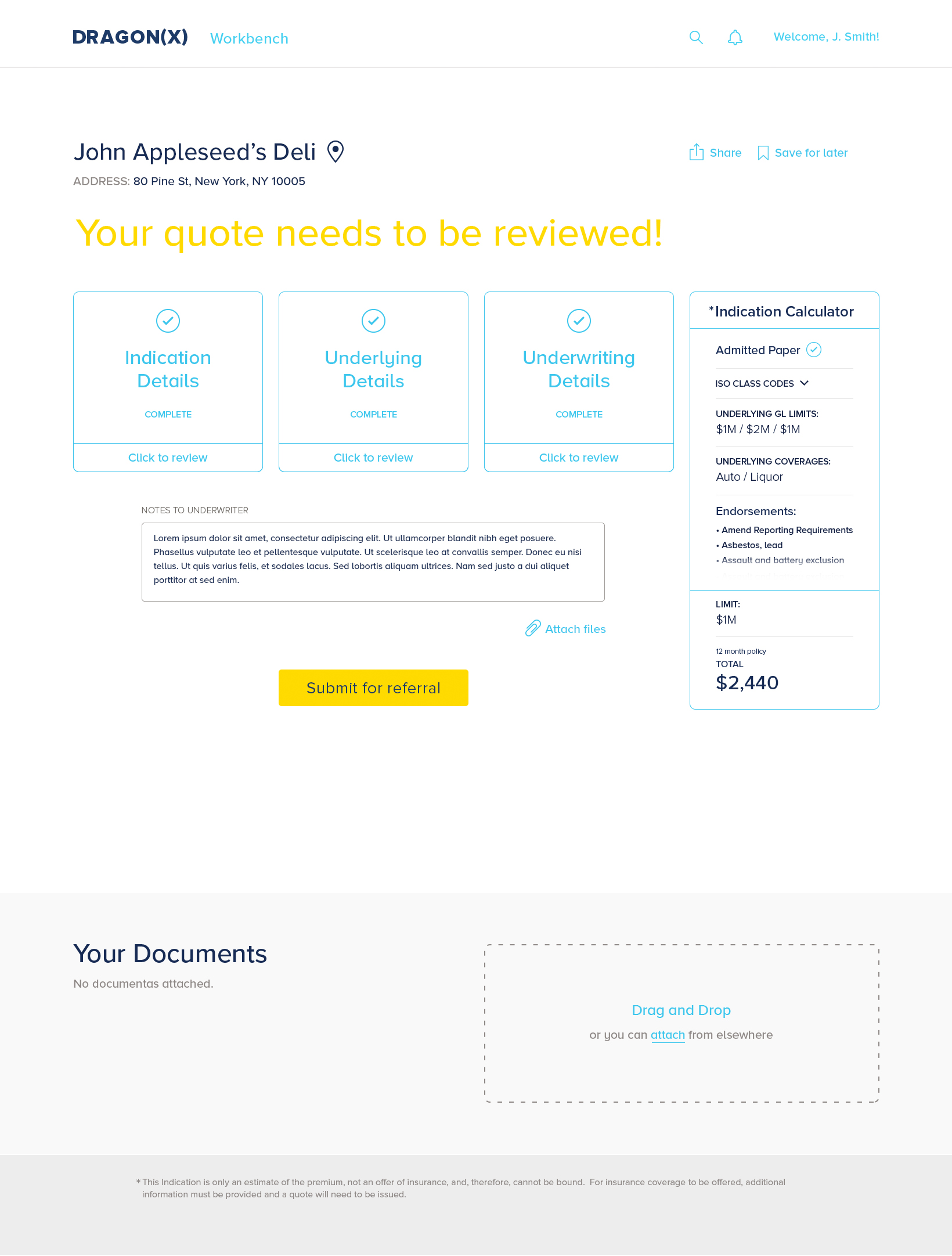
When testing and interviewing users, I would take notes on the things we needed to solve. One of them was, for example, that when an application needed to be referred for an underwriter to review, brokers always have a specific note or files they would like to communicate to the underwriter about the application (usually done by calling them). We decided to incorporate a free form along the ability to attach files before submitting for referral for the underwriter to review and reduce the need to make a call.

UI AND VISUAL DESIGN
Application process to get a quote


Form Drawer where all information for an account is stored.

The Workbench used to manage and track the broker's accounts, tasks and activity.

The underwriter's Workbench is focused on receiving and reviewing referrals.
There is more to see!

Meal Delivery
How can we take the user to understand the service while also taking him/her to try it and order in a few steps?

Healthcare
How can we transform patient visits from arrival to check-out and help clinics be more efficient?

Fleet Management
How to help small businesses in LATAM manage and have control of their fleet?